Helping teams build accessible products

Helping teams build accessible products

Helping teams build accessible products

Over the years I've assisted many teams in improving the accessibility of their products and websites. I'm trained in auditing for WCAG compliance and have spent time working with disabled users trying to understand how to design with an inclusive mindset.

In 2019 I worked with The Scottish Government, testing designs with disabled users. This involved travelling around Scotland with a camera recording observations to play back to our team. It was a formative experience for me that has influenced my work ever since.

Clips from a user testing study I conducted in 2019 for The Scottish Government and Whitespace

Designing for WCAG compliance

After completing a rigorous Digital First Assessment in 2020 and in response to accessibility testing outcomes, our team released major updates to Scotland.org to comply with WCAG AA guidelines.

Scotland.org is an important marketing site for The Scottish Government, with a strong brand. We worked carefully to develop the rich visual appeal of the site while remaining mindful of the diversity of its users.

After completing a rigorous Digital First Assessment in 2020, and in response to accessibility testing outcomes, our team released major updates to Scotland.org to comply with WCAG AA guidelines.

Scotland.org is an important marketing site for The Scottish Government, with a strong brand. We worked carefully to develop the rich visual appeal of the site while remaining mindful of the diversity of its users.

a young persons hand holding a mobile phone displaying a website

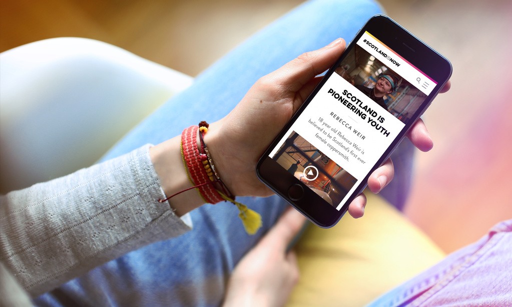
A marketing visual promoting the scotland.org site

Accessible styling systems

Understanding how different colours are perceived by different people is an important responsibility for designers. Although the use of contrast checkers is becoming commonplace, it's rare for designers to question how contrast algorithms work and why contrast changes across different hues.

I've found learning about the science of colour to be a fascinating subject (Nate Baldwins colorandcontrast.com is a great place to start) and a subject which has greatly improved my work, especially when designing for multiple brands.

When auditing products and sites, the relationship between semantics and style is one of the areas that almost always causes issues.

Typography scales are traditionally expressed using semantic HTML structures like headings and paragraphs. Semantics help assistive technology users navigate digital content, however the naming conventions are often seen by designers as simply a way to specify styles. Heading structures quickly break down when designers are tempted to use different font sizes in an order that makes little sense from a semantic perspective.

That why I usually recommend uncoupling typography styles from HTML tags. Although I would always try to align visual and semantic structures, avoiding the casual use of a h4 instead of a h2 is often the best option.

Giffgaff design have a great example of this approach, and the Gusto Design Team have written about their experiences choosing naming conventions for typography tokens.

Understanding how different colours are perceived by different people is an important responsibility for designers. Although the use of contrast checkers is becoming commonplace, it's rare for designers to question how contrast algorithms work and why contrast changes across different hues.

I've found learning about the science of colour to be a fascinating subject (Nate Baldwins colorandcontrast.com is a great place to start) and a subject which has greatly improved my work, especially when designing for multiple brands.

When auditing products and sites, the relationship between semantics and style is one of the areas that almost always causes issues.

Typography scales are traditionally expressed using semantic HTML structures like headings and paragraphs. Semantics help assistive technology users navigate digital content, however, the naming conventions are often seen by designers as simply a way to specify styles. Heading structures quickly break down when designers are tempted to use different font sizes in an order that makes little sense from a semantic perspective.

That is why I usually recommend uncoupling typography styles from HTML tags. Aligning visual and semantic structures is important, but avoiding the casual use of a h4 instead of a h2 is a great safety net.

Giffgaff design have a good example of this approach, and the Gusto Design Team have written about their experiences choosing naming conventions for typography tokens.

a range of colours and a list of typography styles

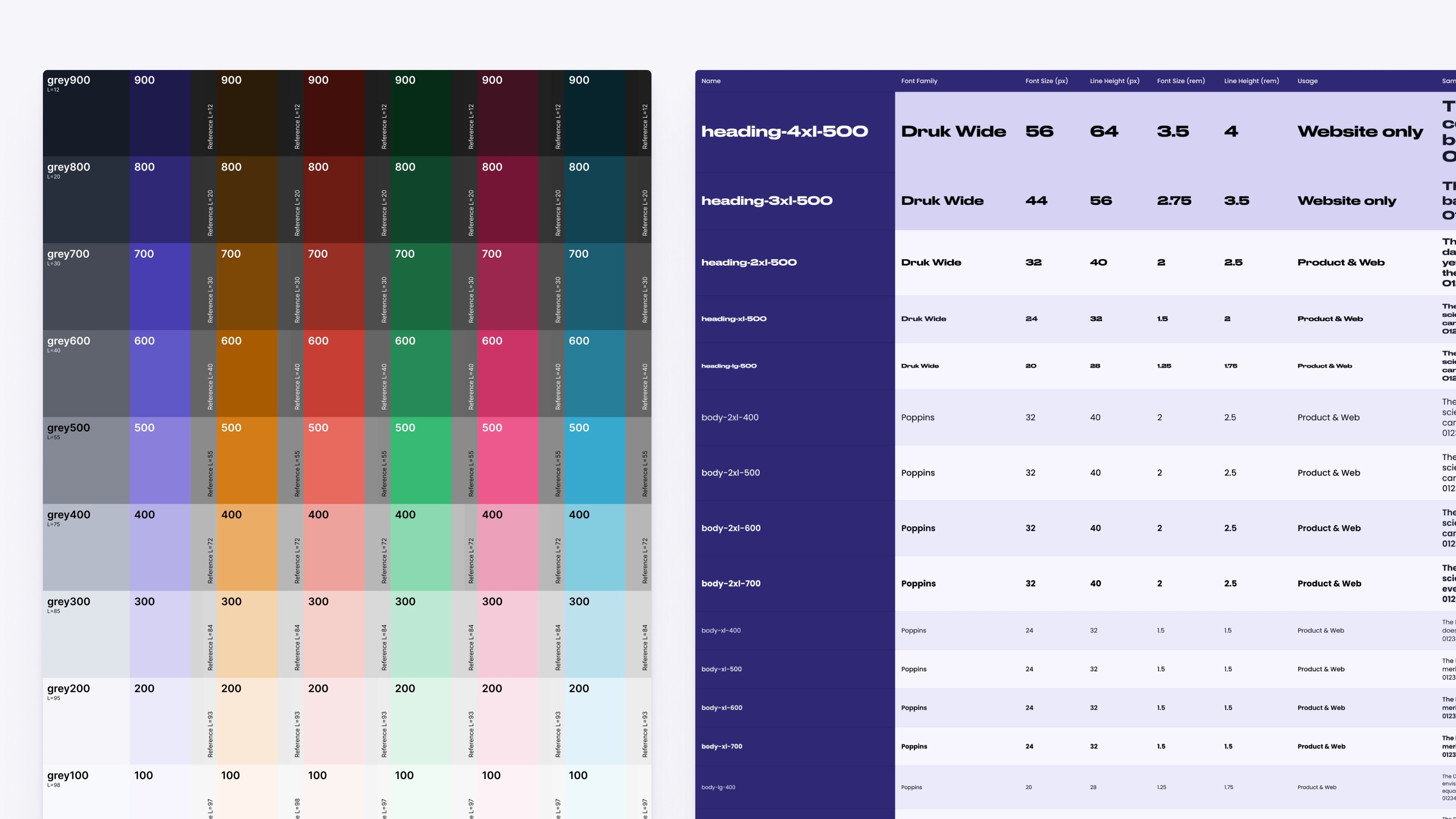
Examples of a perceptually uniform colour scale and a typography scale using t-shirt sizes for FairHQ

Building accessible components

When it comes to accessible components, my advice is usually to stand on the shoulders of giants and find a library that works for you.

One of my favourite libraries is Radix UI. It's unstyled, thoroughly tested and most developers I've worked with love building with it.

Accessibility is often seen as an obstacle that startups don't have time for. But attempting to retroactively "fix" your product will take far longer. Companies like Linear and Vercel have used Radix to scale beautiful products at incredible speed without sacrificing accessibility.

I've used Radix at Ignition and Fair HQ to inform my design work and build accessible components with our teams.

When it comes to accessible components, my advice is usually to stand on the shoulders of giants and find a library that works for you.

One of my favourite libraries is Radix UI. It's unstyled, thoroughly tested and most developers I've worked with love building with it.

Accessibility is often seen as an obstacle that startups don't have time for. But attempting to retroactively "fix" your product will take far more time in the long run. Companies like Linear and Vercel have used Radix to scale beautiful products at incredible speed without sacrificing accessibility.

I've used Radix at Ignition and Fair HQ to inform my design work and build accessible components with our teams.

a screenshot from a component documentation website alongside some finshed components

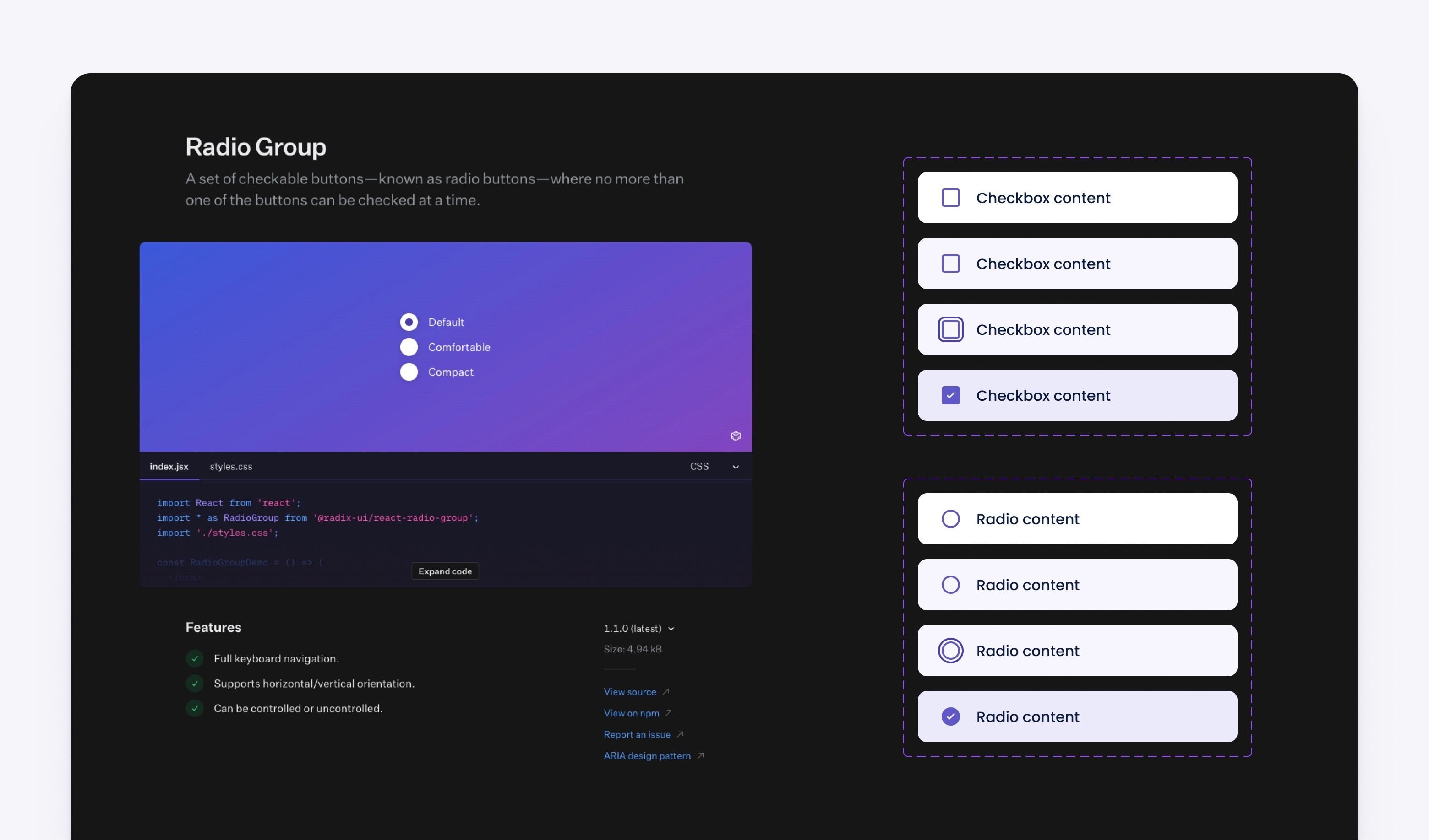
An example of radio button and checkbox components we build using Radix UI at Fair HQ

Let's work together

Let's work together