Multibrand design system for rapid restyling
Designed for
Ignition & M&G
Date
Q3 2021
Role
Senior Product Designer
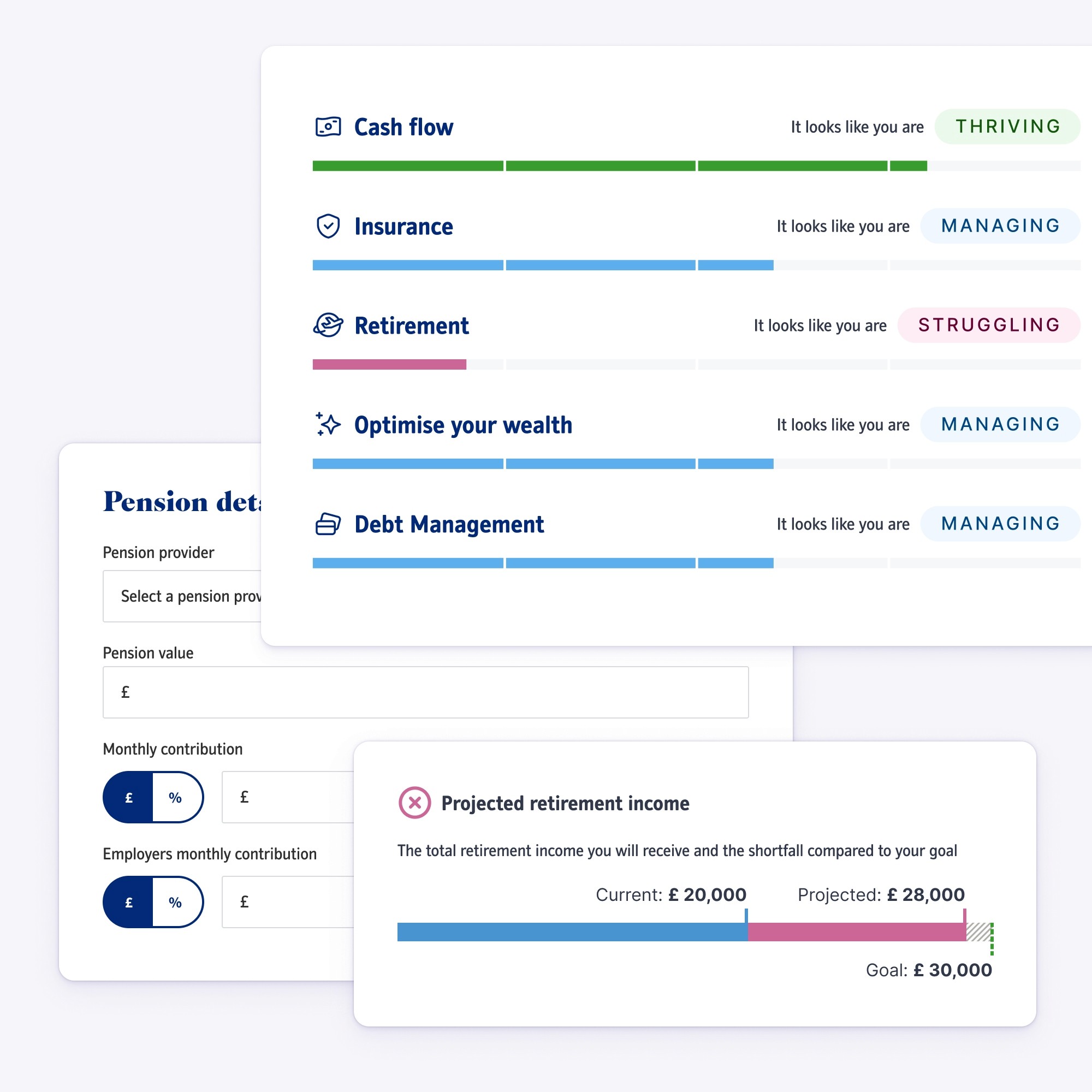
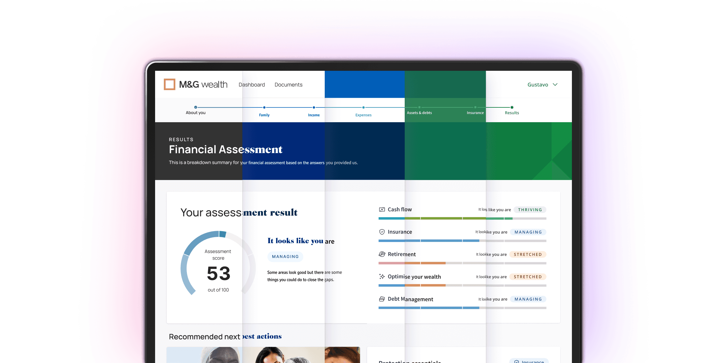
Ignition initially built a D2C business before pivoting to a B2B white-label "hybrid" financial advice platform. This evolution meant that when I joined, the team had very mature and capable technology, but lots of legacy UI that needed refactoring into a system that could be easily restyled when new clients came onboard.
Impact
One of the first restyling exercises when I joined the team, took a week to complete. By the time I left we had reduced that lead time to less than a day; an 80% saving in design and development resources and a significant increase in our ability to respond quickly to client requests and sales opportunities.
The problem
The original Ignition product was designed in Sketch, and like many design teams at the time, we had to migrate those files into Figma. There were minimal guidelines around how components had been designed and whether they aligned with production.
As Ignition won new clients, we were supplied with styleguides usually devised for marketing materials rather than UI design. Colour specifications often failed contrast checks and limited palettes resulted in designs that lacked visual depth and hierarchy. Translating brand colours into something more suitable for a product was a time-consuming process.
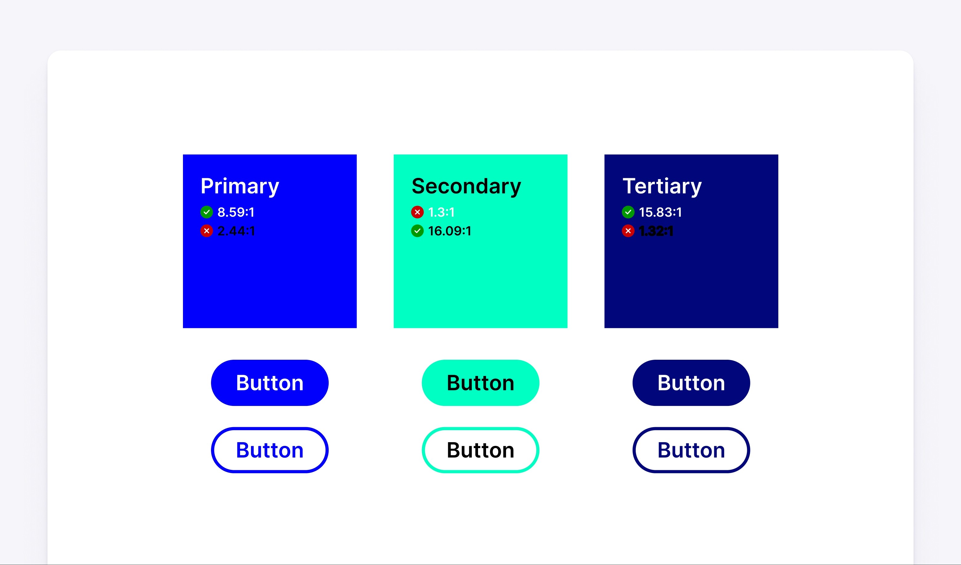
Typical marketing-focused colours supplied by a client
Auditing and inventory
Creating an inventory of components across Sketch and Figma and understanding how they aligned with production was an important first step. I screen-grabbed everything I found, cross-referenced design files with frontend components and organised them by the effort required to get everything in sync.
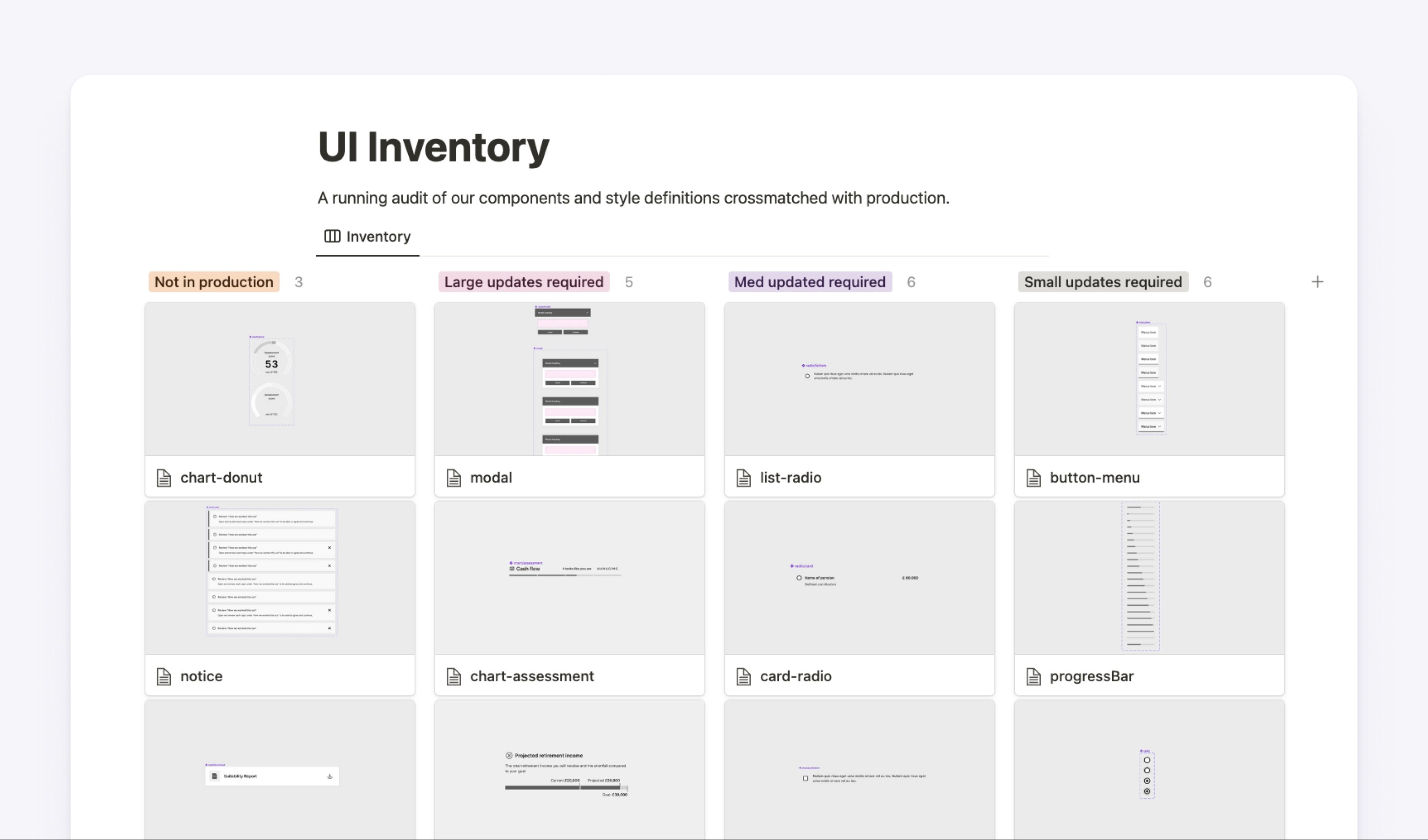
UI Inventory with component screenshots
Uncoupling the styling layer
Previously, components had been created using client-specific styles in the local file. Separating the "styling layer" was an important part of working towards components that were brand-agnostic. My goal here was to create a UI-Kit that was purely focused on structure and behaviour so that styles could be swapped in and out of local design files.
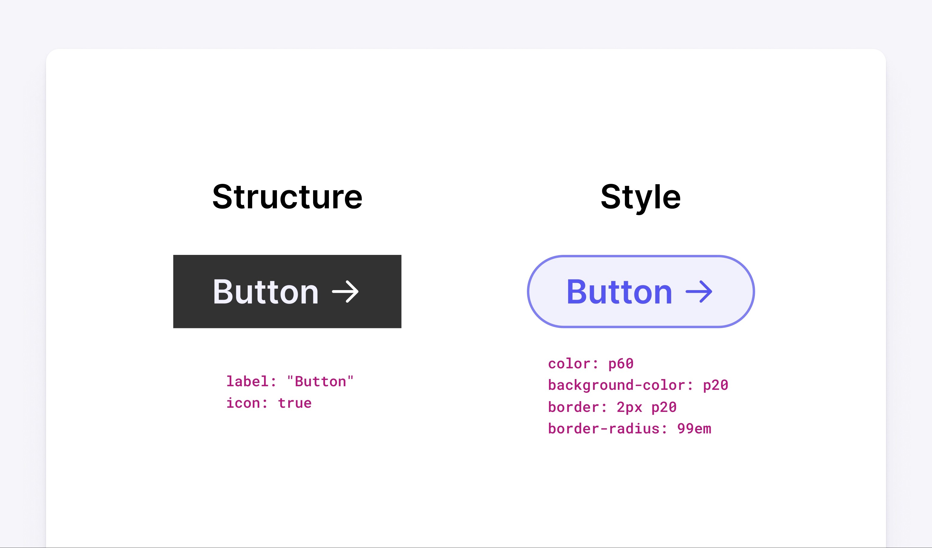
Simple example of a button component with structure and style defined separately
Creating a perceptually uniform colour system
Perceptually Uniform Colour Spaces can be a complex topic; in brief, the term refers to attempts to "even out" the way the human eye perceives different colors as brighter than others. At Ignition, we had no control over the brand colours our clients chose. This often made out goal of creating accessible, harmonious interfaces challenging. To help overcome this problem, I created a system to generate predictable and perceptually uniform scales regardless of brand colours.
Although there are plenty of good models (HSLuv, CIELUV, OKLAB) and tools (Github Prism, Supa Palette) to help with this problem. I found a manual system was easier for other team members to understand, created better results and avoided external dependencies.
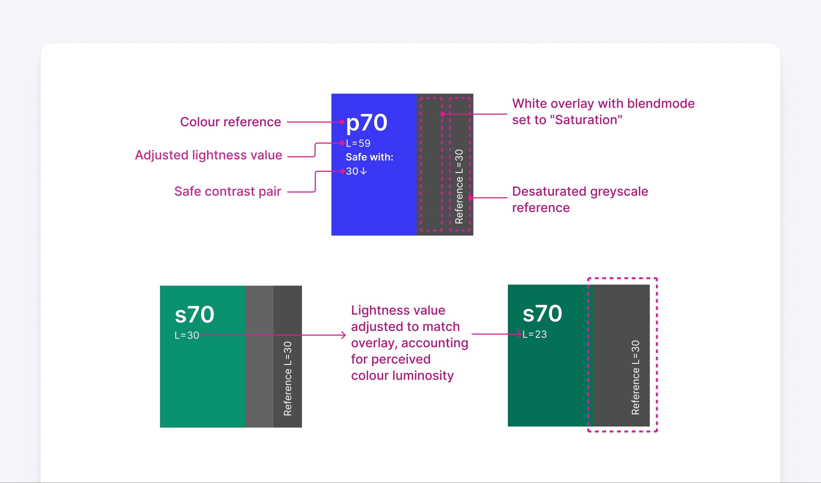
The system was based around a special swatch design that helped match any colour to a reference desaturated, greyscale value.
An explanation of how swatches can be mapped to reference greyscale values
Hue values were locked to the brand colour. Saturation and Lightness values were adjusted so that desaturated versions of the colour matched a reference grey value.
Using this system we could create components with much richer visual hierarchy (using tints and shades of brand colours) while ensuring contrast remained predictable and WCAG compliant. This uniformity is easily communicated by desaturating each scale.
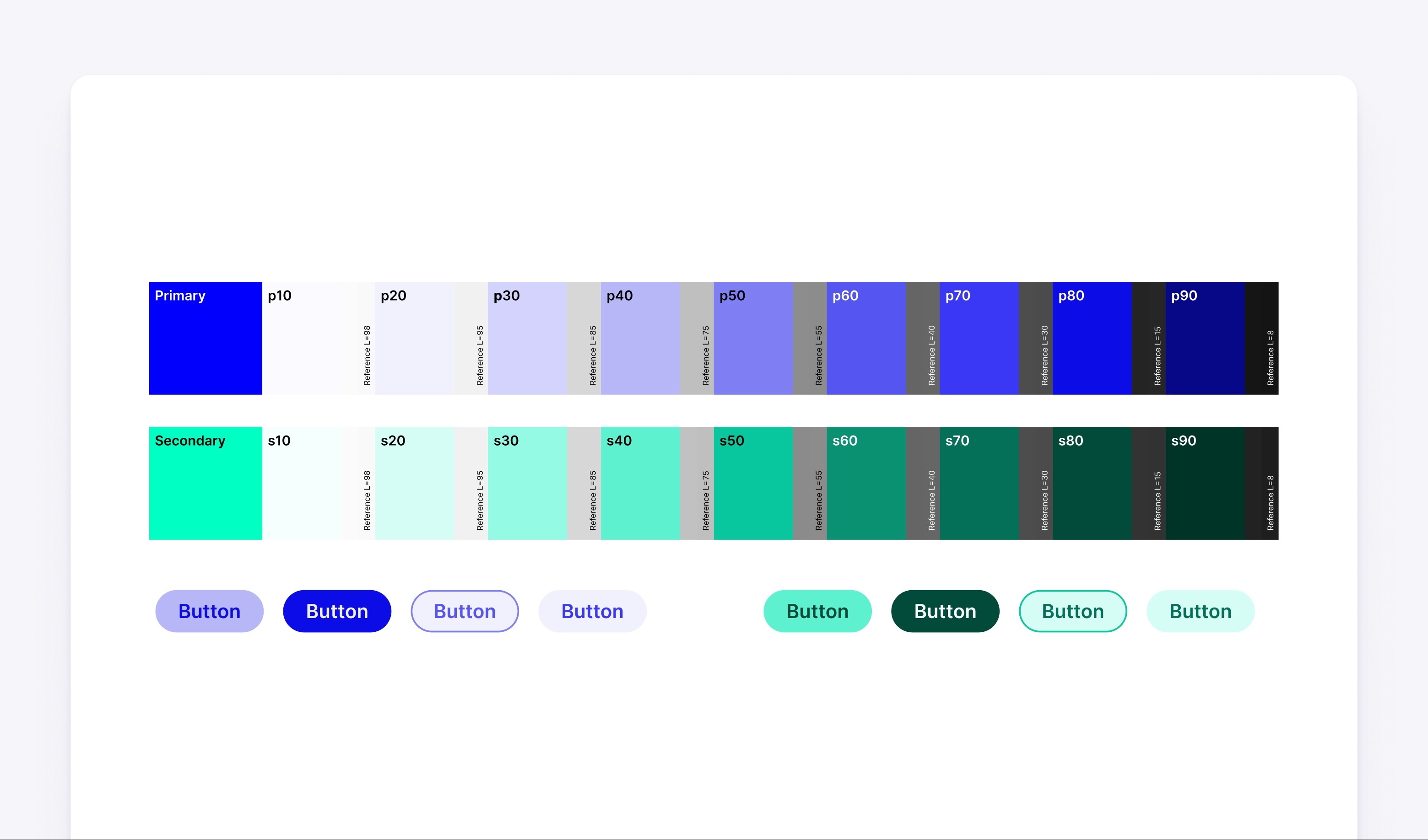
Example colour scale of primary and secondary brand colours using the system
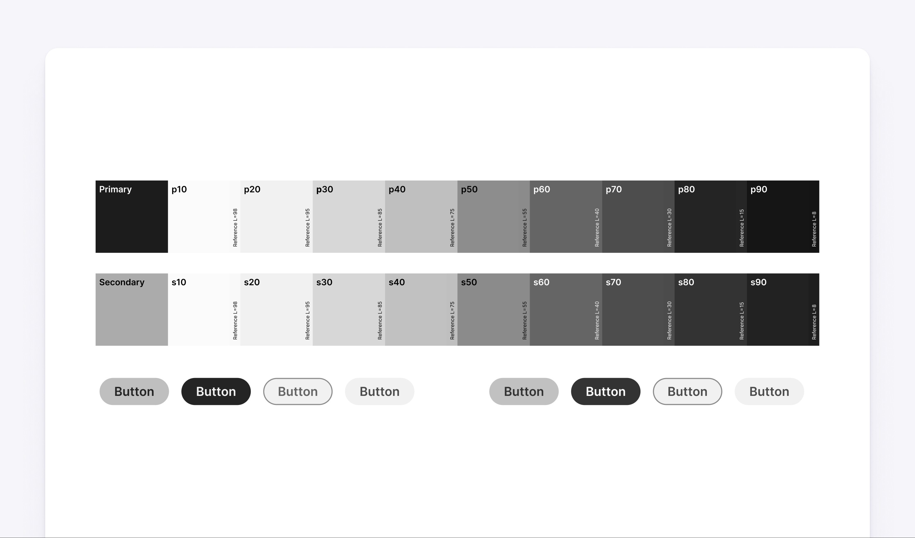
The same colour scales fully desaturated
Referencing external style tokens
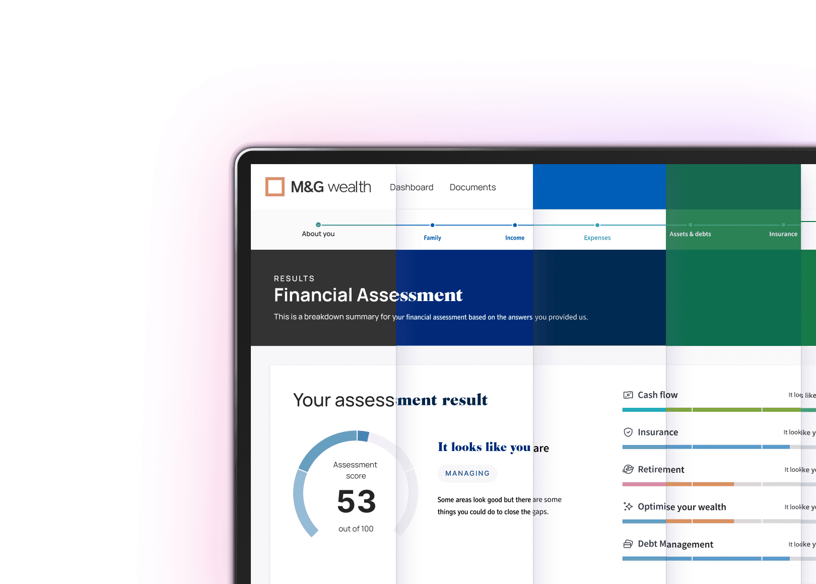
Each time we were working with or pitching for a new client, a styleguide was created based on the client's core brand colours. This approach meant that developers could use JSON data from the styleguide to rebrand the frontend in the same way as designers would in Figma, from the same source of truth.
The goal was to store token data in an external source like Supernova or Specify. In the shorter term, we tested our setup using the Swap Libraries feature in Figma.
Testing our setup with the swap libraries feature in Figma
Outcomes and tradeoffs
As the only designer in Ignition's EU team, and with the vast majority of technical staff based in Sydney, it was challenging to work as closely with developers as I would have liked for this kind of project. That being said, we made huge strides in understanding how to create consistently high-quality, accessible components, regardless of what styles the client threw at us.