Helping customers understand and engage with ESG investing
Designed for
Ignition & M&G
Date
Q1 2022
Role
Senior Product Designer
Ignition build whitelabel financial advice solutions for some of the world's largest financial institutions. Having successfully launched a number of pension journeys with M&G Wealth, we were asked to explore and test new approaches to help engage customers in ESG investing with a short turnaround of just 4 weeks
Impact
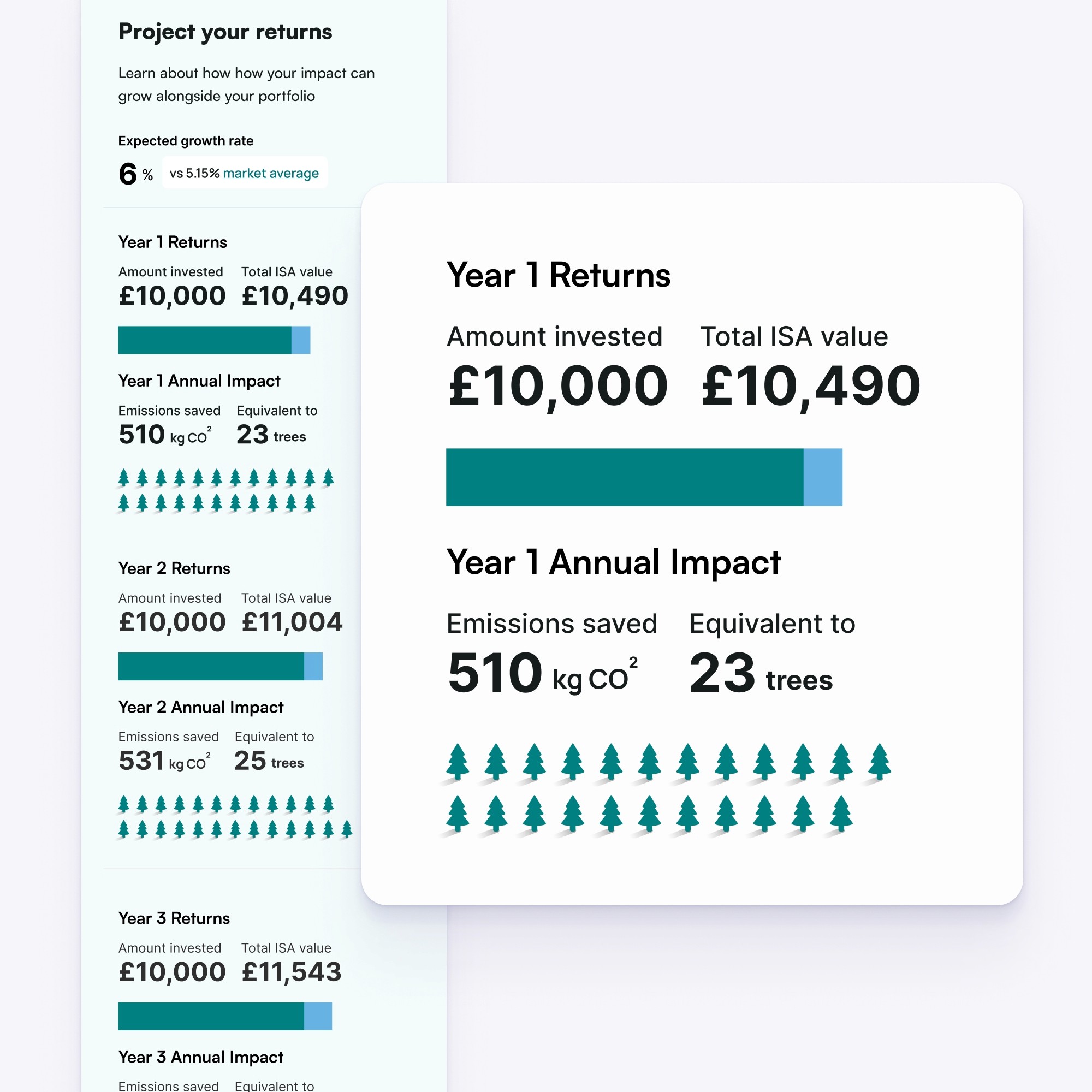
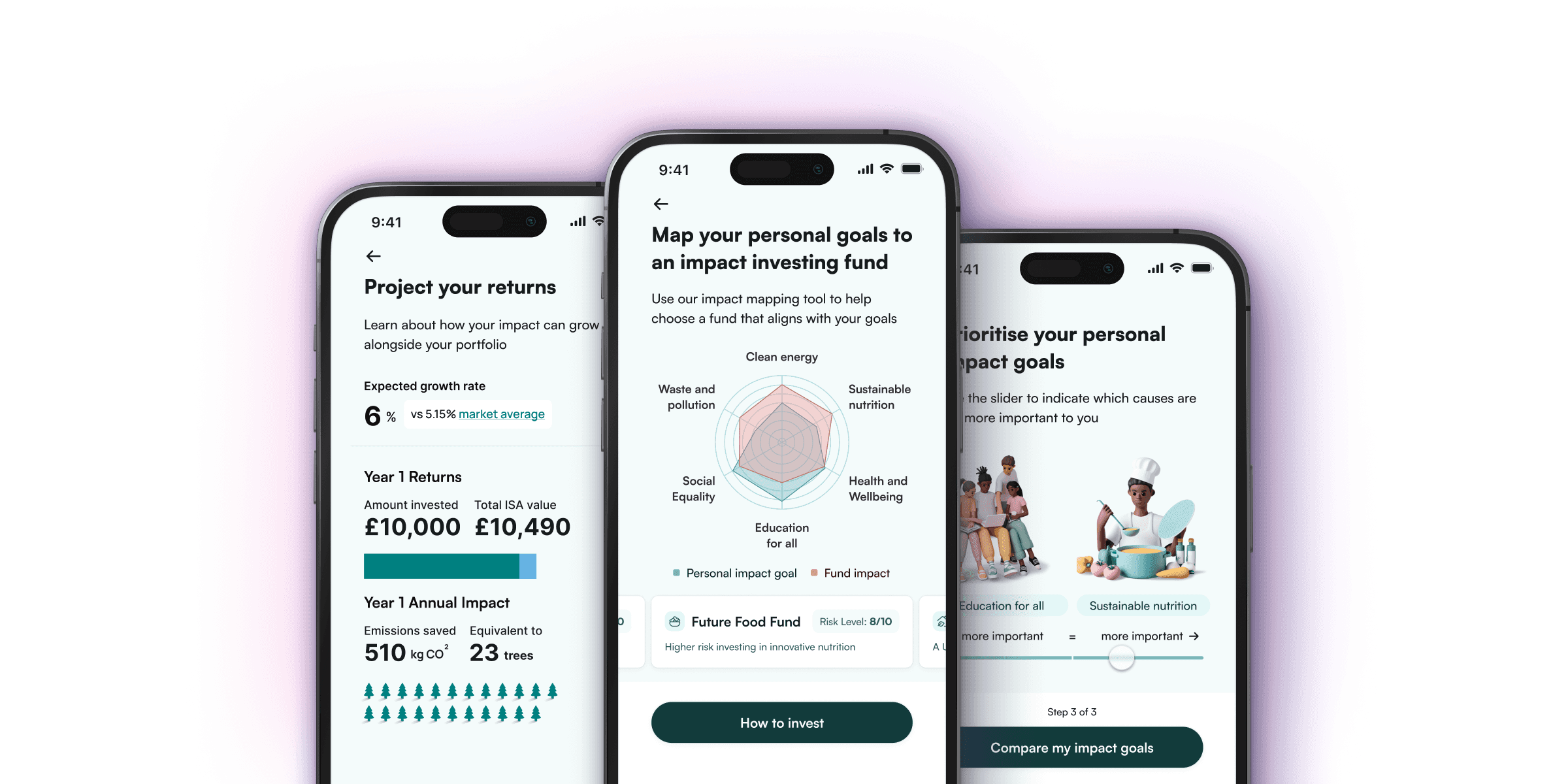
Our hypothesis was that by creating interactive and personalised educational content we could help users gain a better understanding of ESG investing and increase their likelihood of considering ESG-focused investment products in future.
We had 3 main targets:
60% of participants complete all research tasks successfully
70% of participants understand more about the potential value of ESG investing for the planet and their finances
20% of participants are more likely to consider ESG-focused investment products
Results surpassed our targets in all areas:
74% of participants completed all tasks successfully
90% of participants had a "better" or "much better" understanding of ESG investing
98% of participants were "more likely" or "much more likely" to consider ESG-focused investment products
The problem
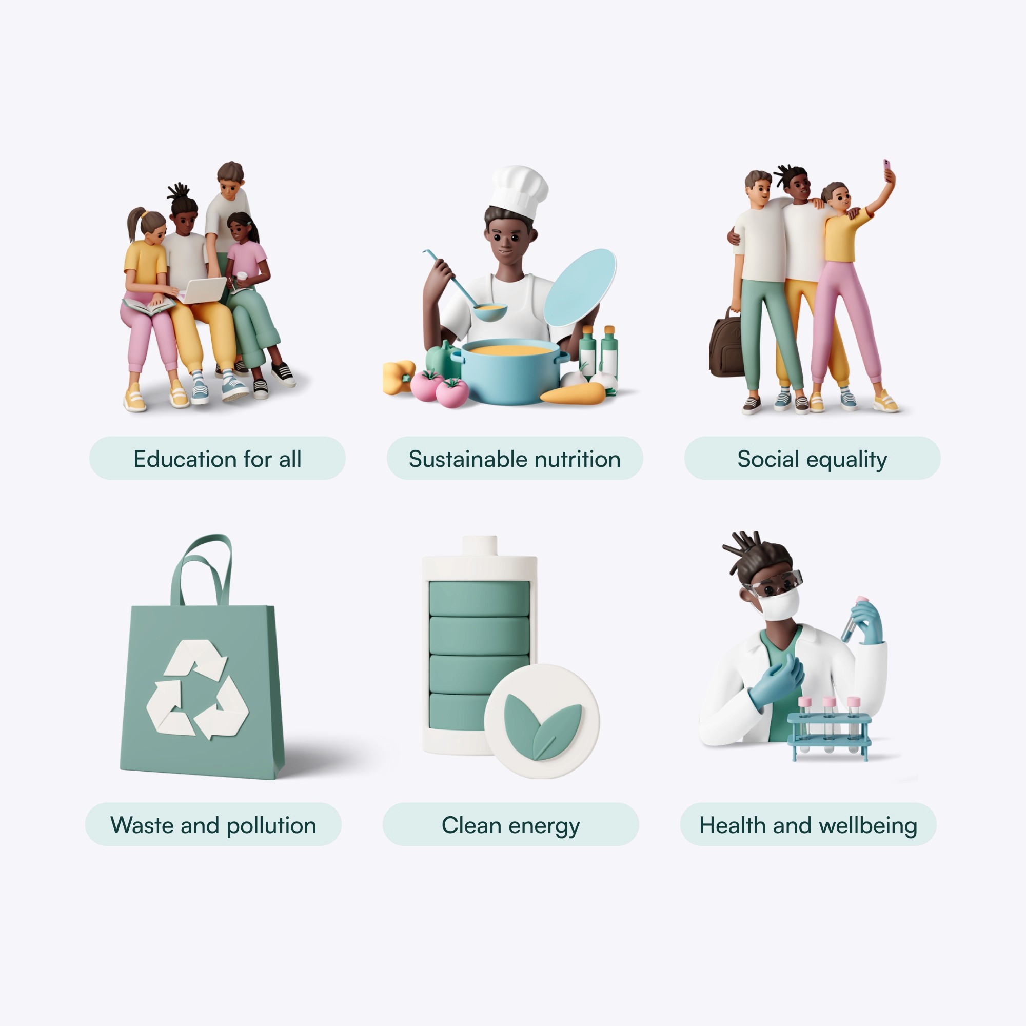
"ESG" stands for "Environmental, Social and governance". The term is used in reference to investment portfolios that screen out companies and funds that don't align with certain sustainability criteria, often referencing the UN Sustainable Development Goals
Research suggests that although 80% of retail investors are interested in more ethical products, only around 10% understand and actively engage with ESG investing. Most customers cited jargon and complex data sheets as a barrier, as well as a lack of trust that ESG investing would have an impact on the causes they're most interested in.
We aimed to create a journey that helped customers learn about ESG investing while allowing them to easily chose products that aligned with their personal goals.
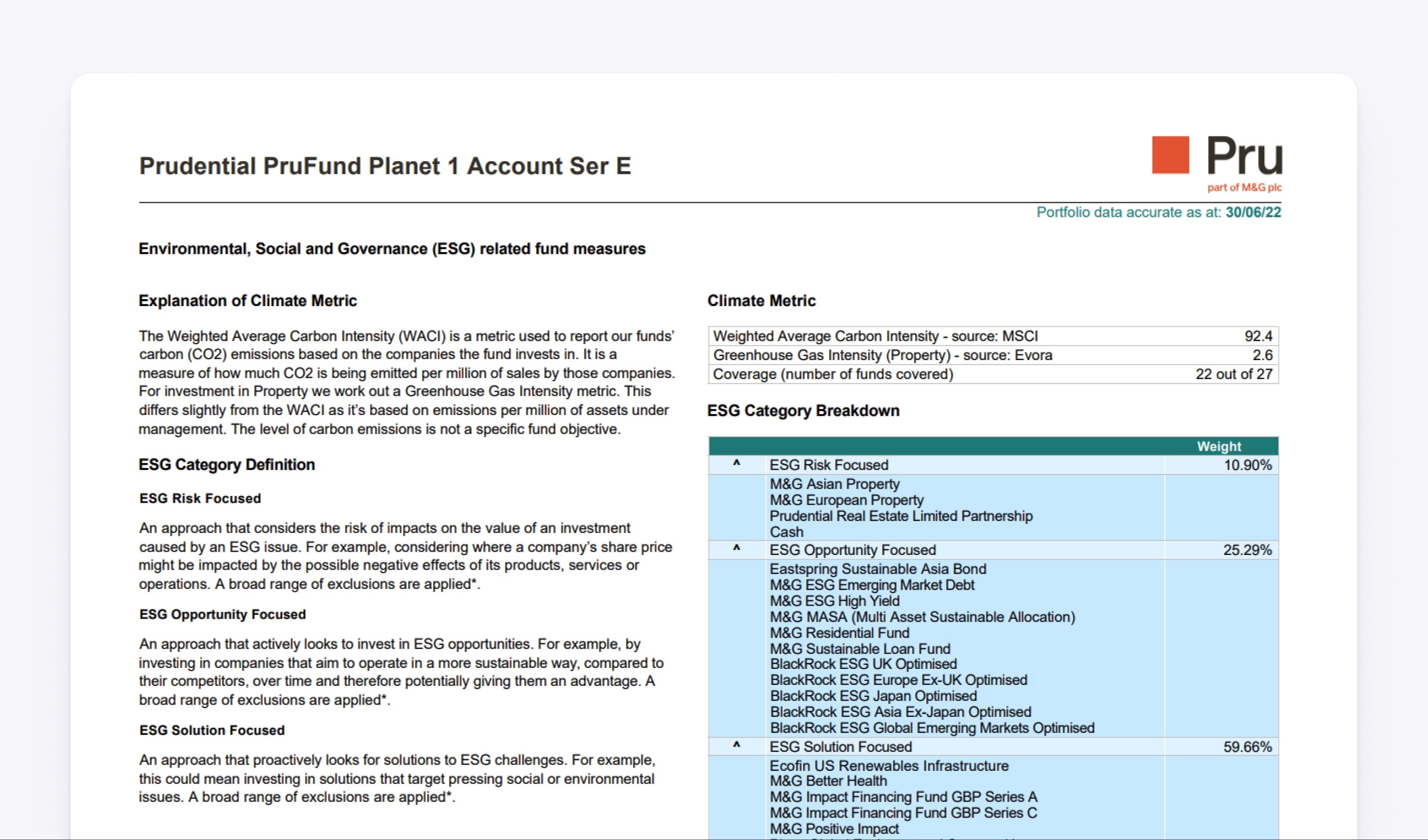
A typical ESG data sheet from M&G
Leaning on our team of (distributed) advice experts
When promoting financial products there are regulations around what you can and can't do without legal checks and professional advice. Financial advisors have good knowledge of the types of things their customers struggle with on a day-to-day basis and luckily at Ignition, we had a large number of financial advice experts on our team. So I created a series of project kick-off workshops to learn more about target users and regulatory boundaries.
Half of our team was based in Sydney, which meant designing the workshops to focus on asynchronous activities for completion offline when our time zones were too stretched for a call.
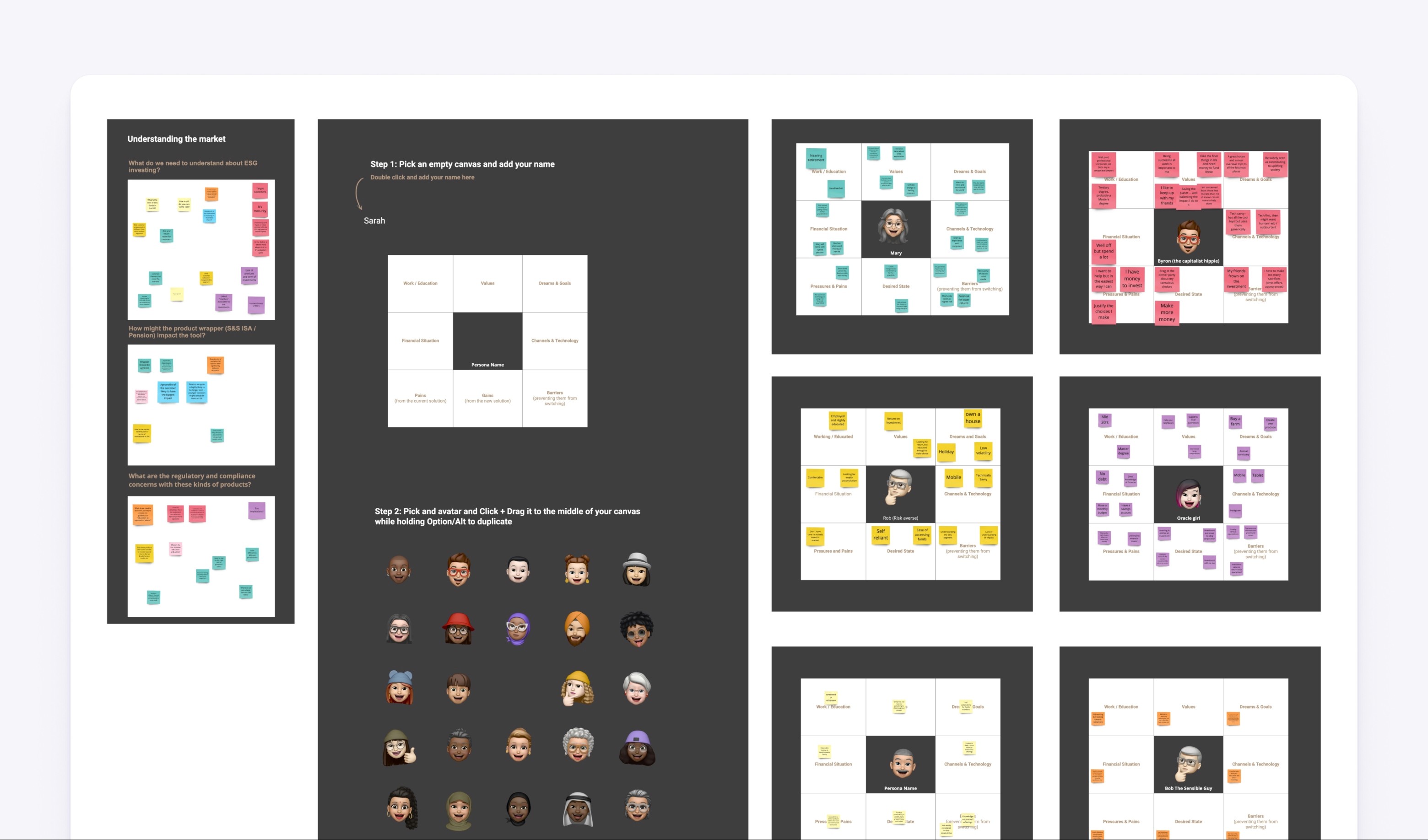
Market risks and persona workshop mapping activities
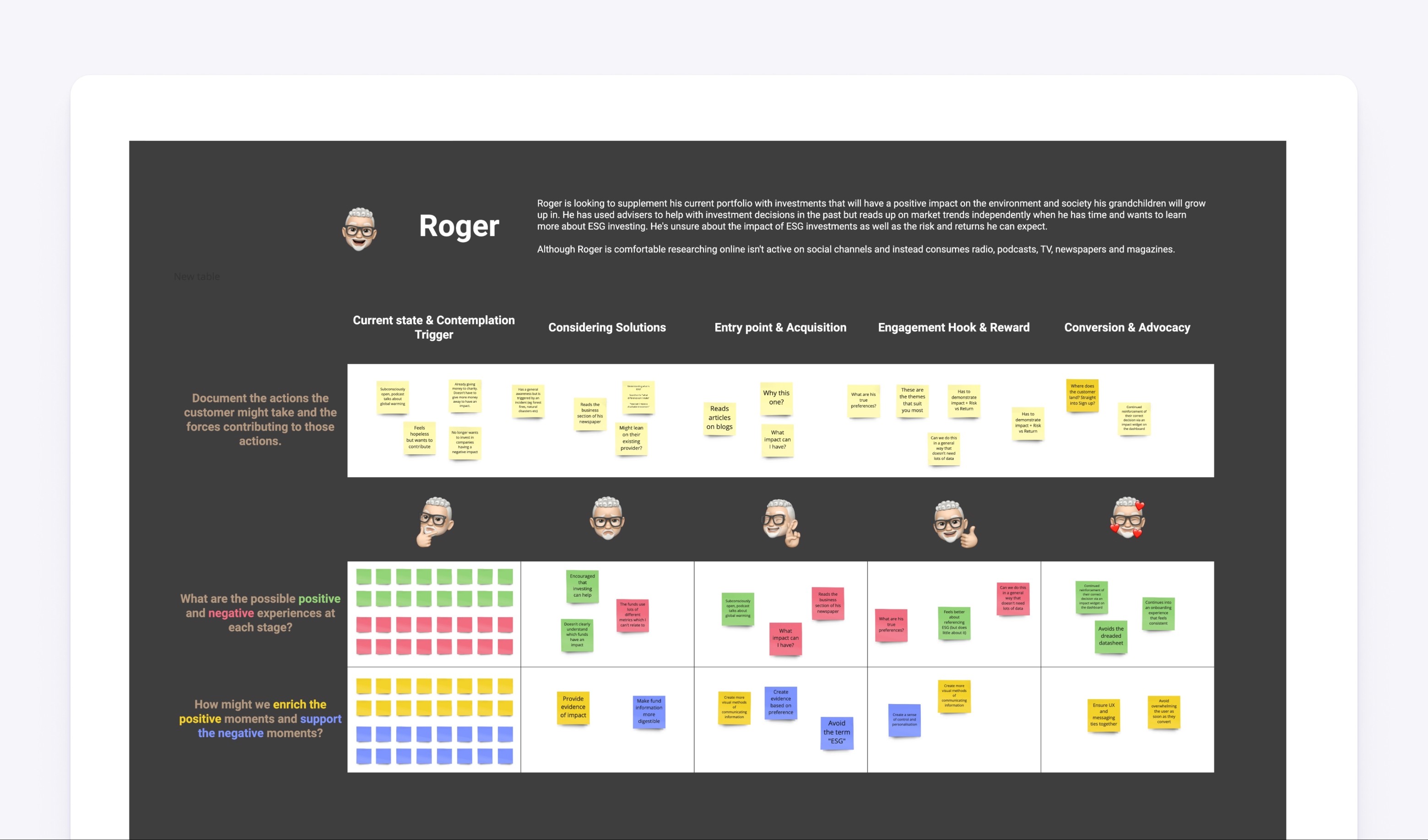
Journey maps were created for each persona we identified
Rapid ideation and iteration
Although most of the team and relatively little design experience, I encouraged everyone to sketch ideas using Tldraw. This tool has a very low barrier to entry and limited fidelity which helps non-designers overcome any fear of drawing.
Designs were then matured into wireframes where we iterated some smaller details and checked for feasibility with our engineering team.
We originally focused on desktop designs, before pivoting towards a mobile app at M&G's request after they began plans to spin up or acquire a mobile-focused product team.
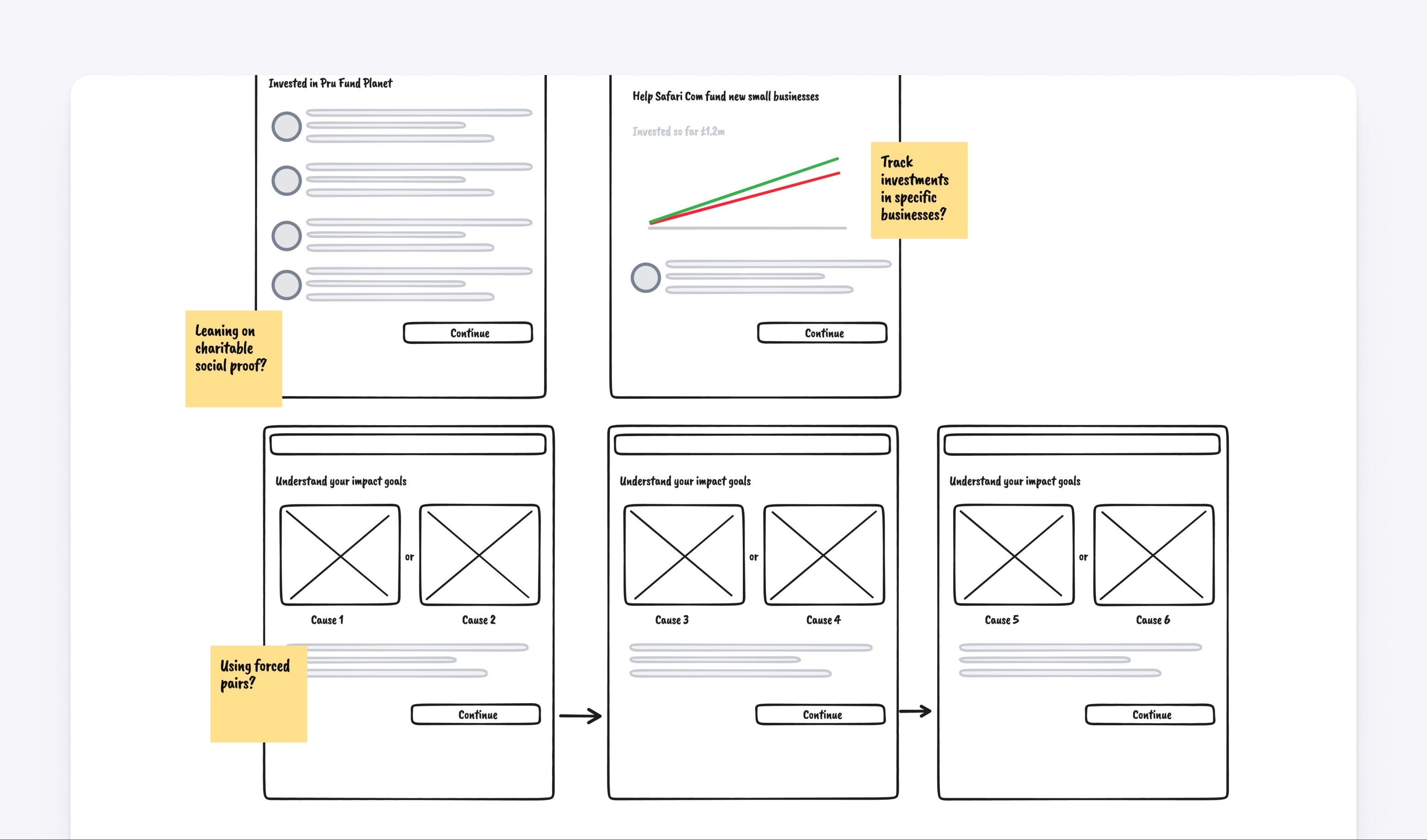
Early team sketching using Tldraw
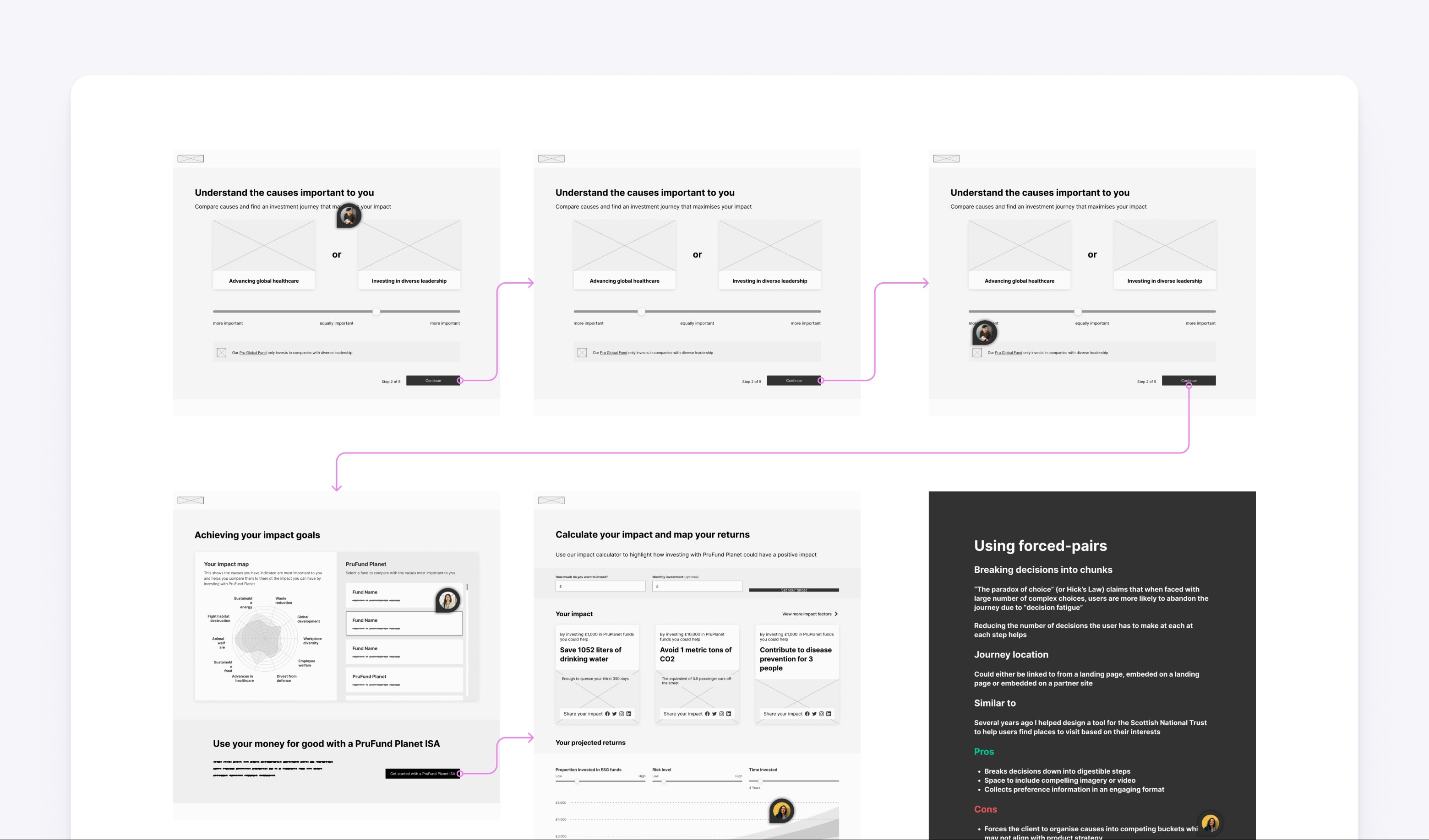
Wireframes with guidance for async feedback
Prototyping and testing
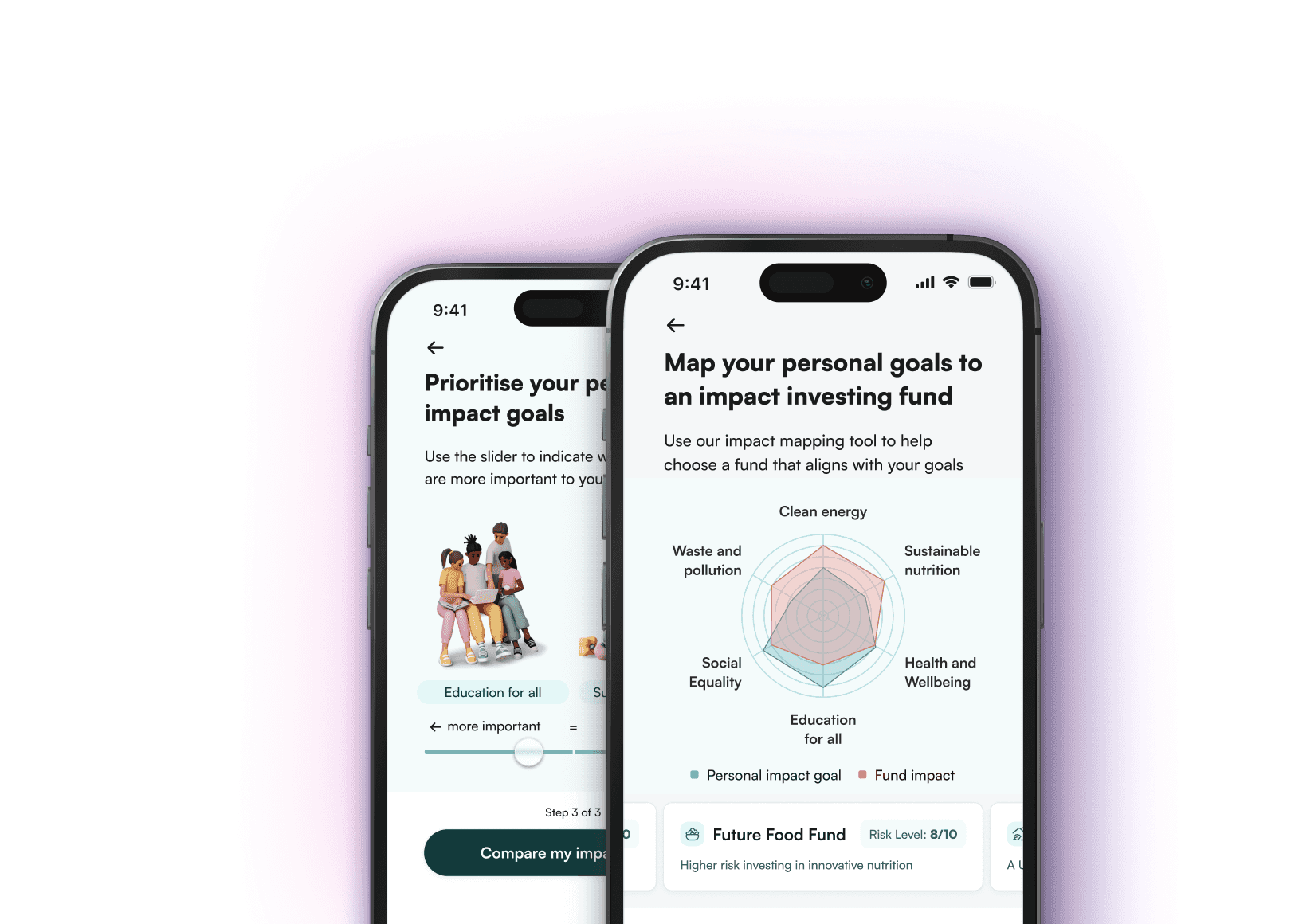
We were interested in developing a concept around the idea of Pairwise Comparison. I felt challenging users to honestly consider which causes were most important would produce an engaging experience and valuable data for personalisation. However, the team had some concerns over how people would react when being asked to prioritise between two worthwhile causes.
Once the final designs were agreed upon, I built a mobile prototype and created a test plan. We had limited time and so chose a remote, unmoderated testing method. This would provide less-accurate results but was very quick to set up and gave us enough confidence to help M&G move forward. Participants were recruited remotely using Askable and screened into older and younger segments with details that closely matched our personas.
Testing was carried out using Maze which included reports on task completion and error location as well as surveys to collect qualitative data.
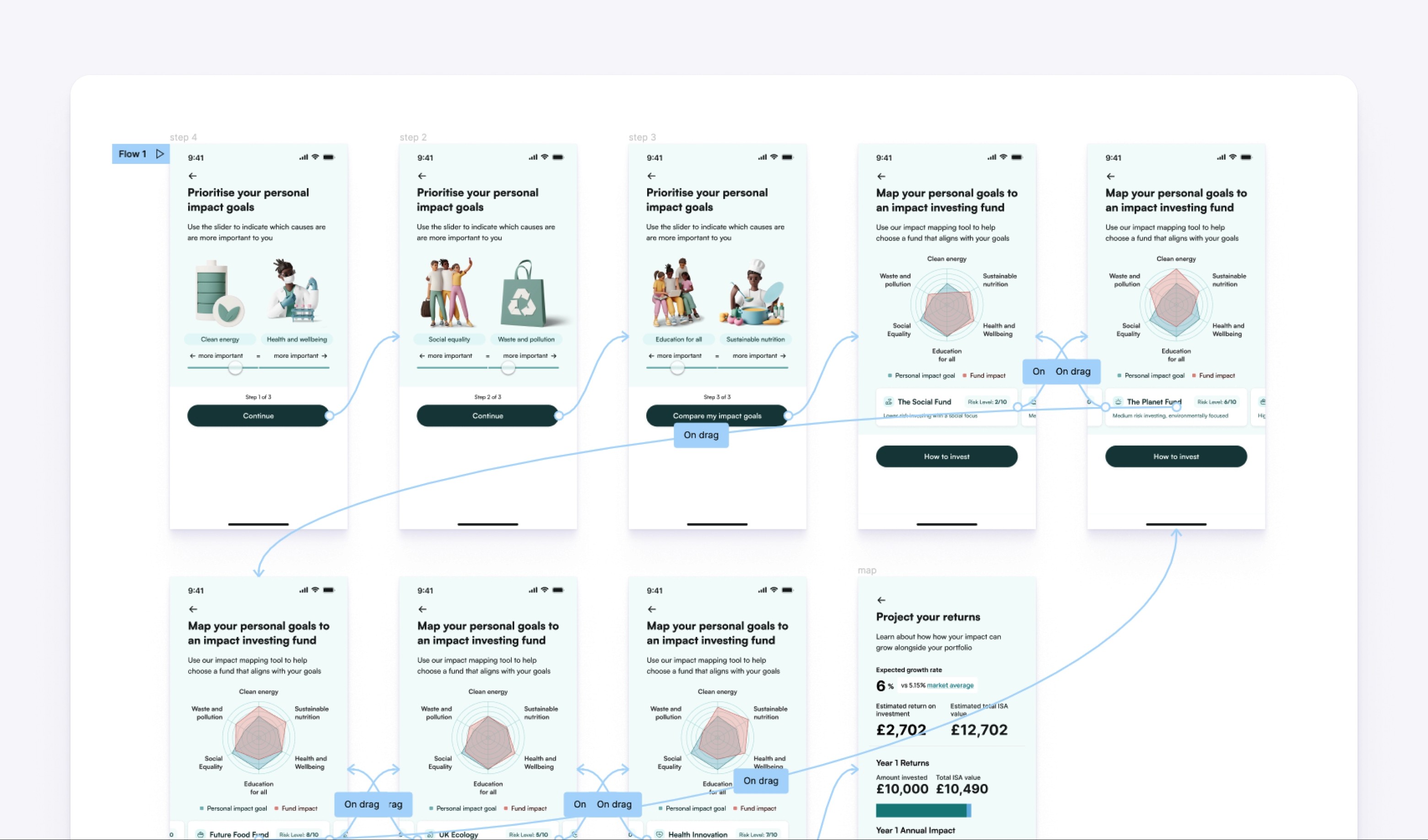
Early prototype work showing a small section of the full journey
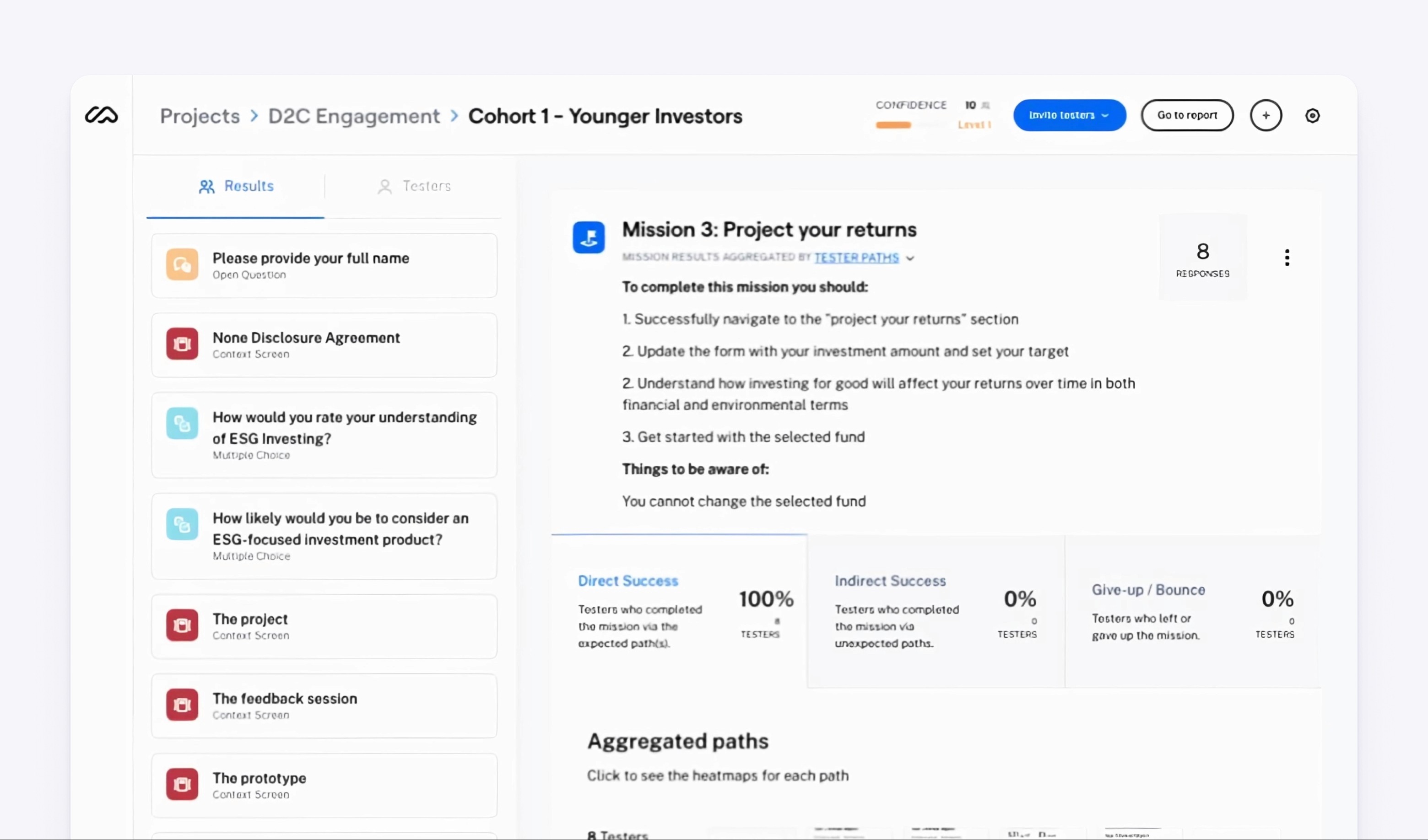
Screenshot from the user testing platform Maze
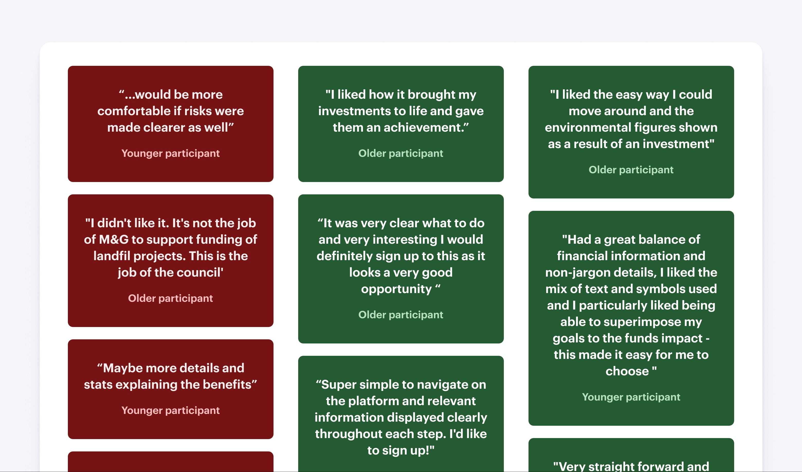
A sample of qualitative feedback showing showing sentiment analysis
Outcomes and tradeoffs
M&G are a key client for Ignition. They helped grow the platform in the European market and our team provided expert support across both financial advice and product development. The project helped validate M&G's vision and continues to inform their move into the D2C ESG market through their recent stake in Moneyfarm.
The project was developed and tested in a very short timescale. Meaning we were forced to make tradeoffs about fidelity and research methods. However, positive results were achieved by a talented team of domain experts who were highly engaged in an intense design process.
Team
