
FairHQ help companies build high-performing, diverse and inclusive teams using data and behavioral science. The platform generates insights and recommendations based on company assessments and employee surveys.
Action-focused dashboard for increased engagement
Designed for
Fair HQ
Date
Q3 2022
Role
Senior Product Designer
Impact
Our team had one major objective for the project: increase engagement by 10%. After launching the new dashboard we saw 12% greater engagement.
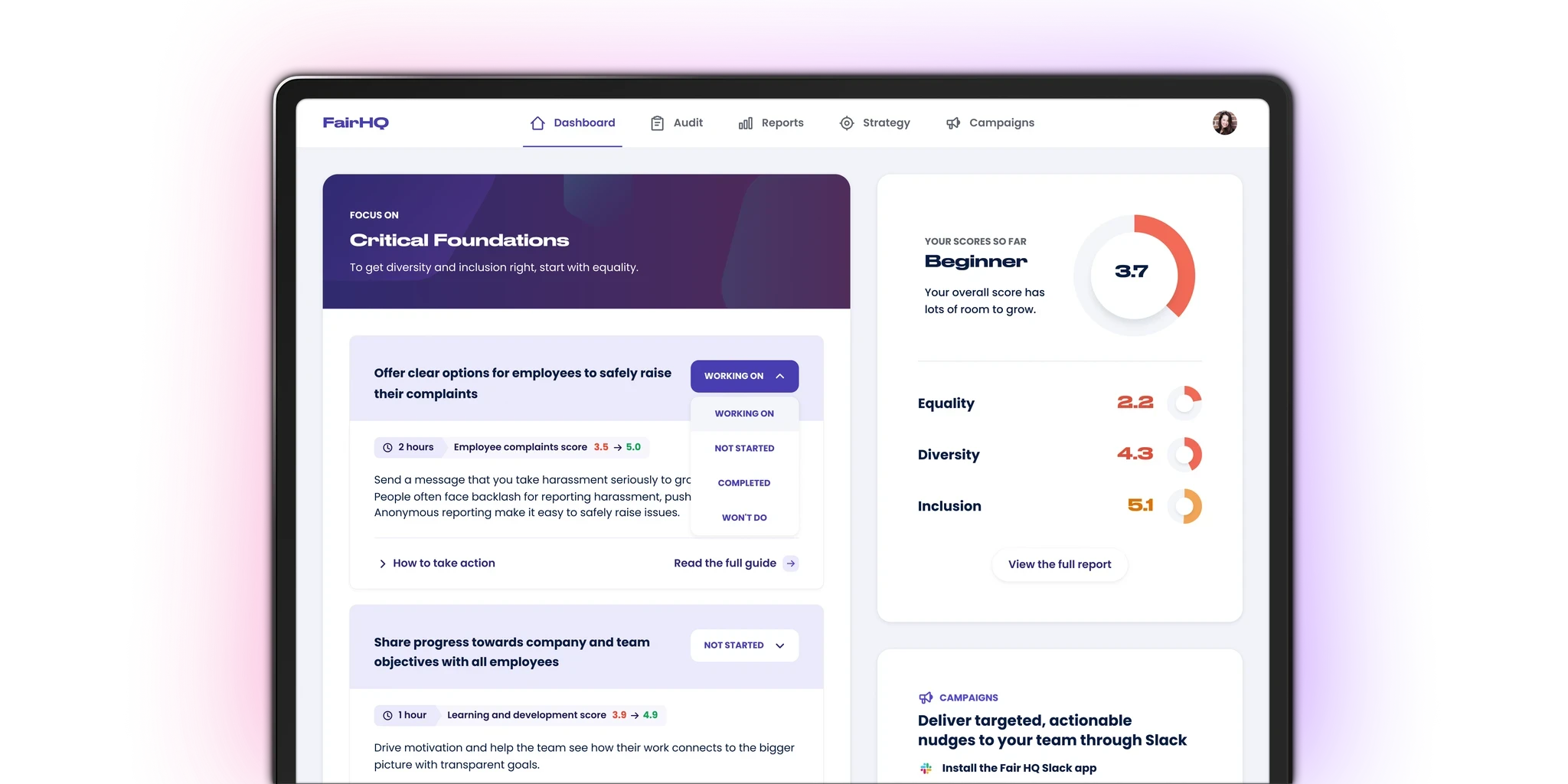
The problem
Research had identified that active usage was peaking every 6 months around assessment times and then falling sharply. The current dashboard focused on assessment scores rather than providing users with the resources they needed to improve. And although we had a huge library of recommendations, feedback suggested users were finding it difficult to utilize the recommendations to take action and improve their scores.
Developing early designs
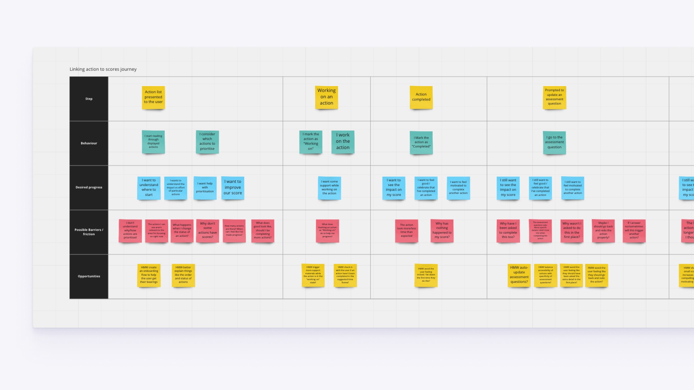
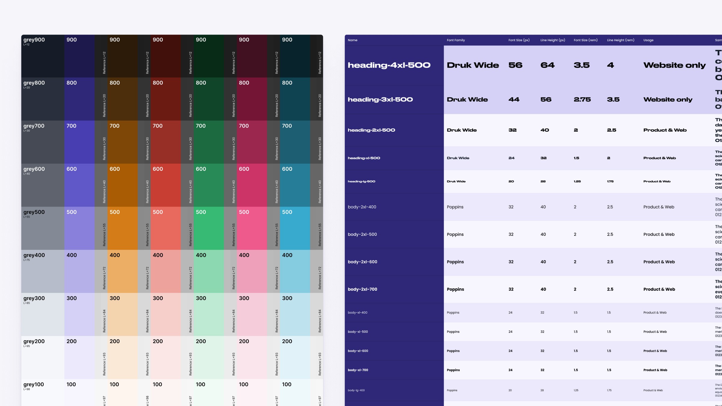
Before I joined FairHQ, the product team had already created some simple layouts of MVP features for the new dashboard. These gave us a great head start for research around technical delivery but the designs lacked properly defined typography and colour scales to help with visual hierarchy. We also wanted to understand the journey a bit more so spent some time mapping out barriers and opportunities for future iterations.
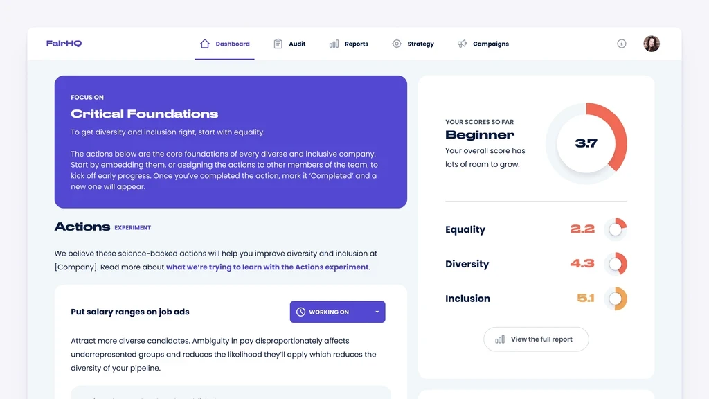
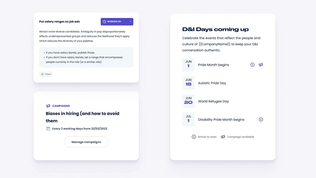
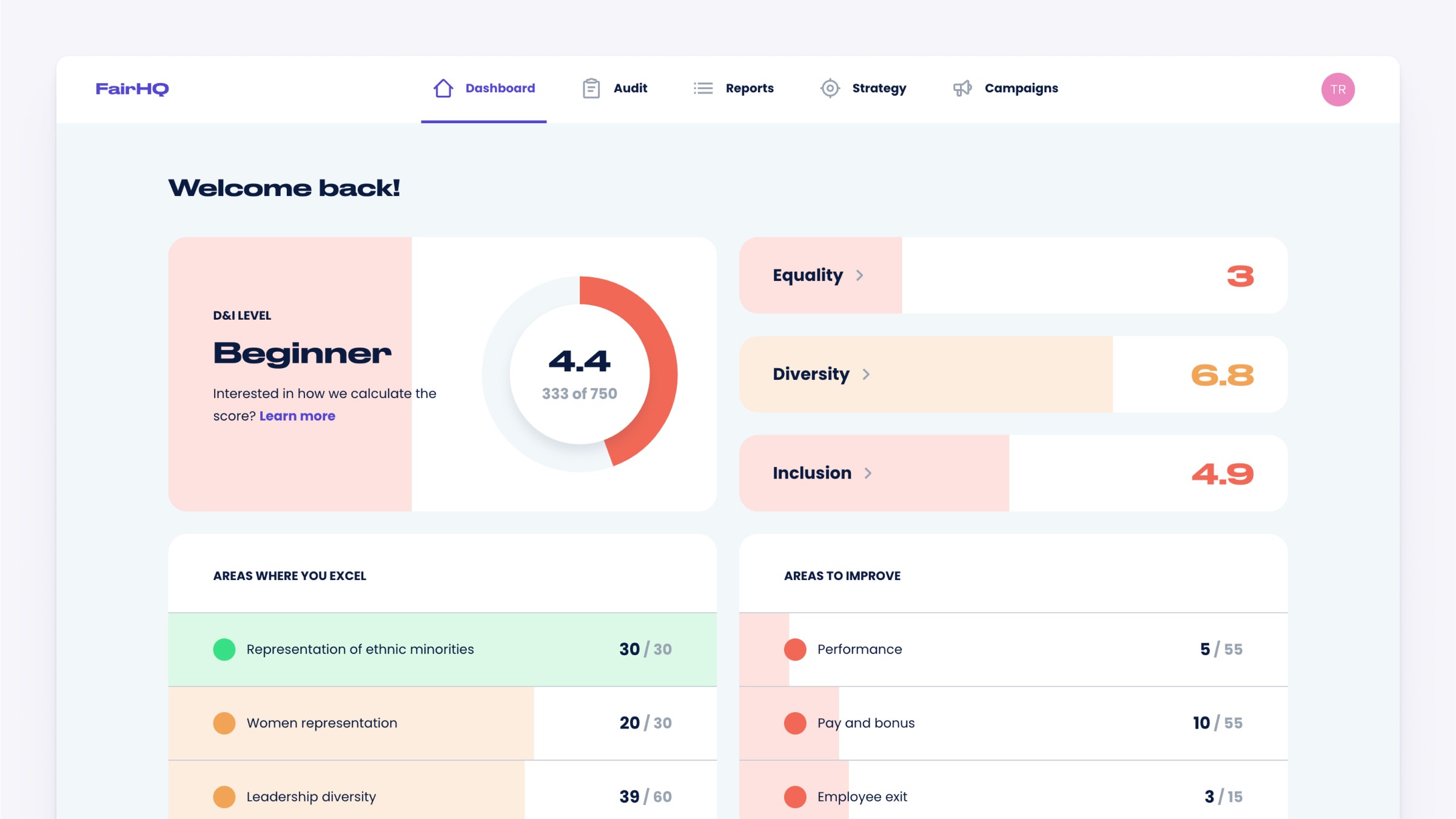
Early layouts of key dashboard features created by the product team
Iterating features with a distributed team
Given the low maturity of the product (still in beta) and a lack of active users to recruit for testing, we decided to release often and ask for feedback during customer-success calls.
This meant we were able to rapidly add small updates to the core features and track engagement over several months.
We worked intensely as a small cross-functional product team and I shared regular videos with the wider company asking for asynchronous feedback. This allowed us to maintain momentum despite working remotely across several time zones.
Discussing micro-interactions and transitions with the product team
Typical design update video requesting feedback from the wider team
Outcomes and tradeoffs
Throughout this project were working within some fairly big technical constraints. The way recommendations and scoring were structured in the codebase meant that we had to find opportunities for small improvements along the way without going down rabbit holes. Having limited active users on the platform meant we didn't feel user testing was the right validation method. This exposed us to some risk that we might make the wrong call. But these risks felt low compared to a more mature product with a larger user base. We were able to take some major steps towards creating a more engaging experience during the lull between assessments cycles and managed to piggyback lots of nice frontend, design system and accessibility improvements onto the work. This felt like a big achievement for a small, relatively new, product team, all while surpassing our target for increased engagement.
Team
Frontend development
Backend Development
Front & Backend Development


