Having successfully launched Scotland's global campaign in 2018, The Scottish Government return to our team at Whitespace to expand areas of the Scotland.org website and conduct rigorous user research studies in line with the government's Digital First Service Standard.
Scotland's global campaign on the web
Designed for
The Scottish Government
Date
Q4 2019
Role
UX Designer
Impact
Since the new Scotland.org site was first launched it has seen an incredible 400% increase in visitor numbers each year. In Phase 2 we saw a 50% increase in our main conversion metric of referrals to partner universities via the expanded "Study" section.
Another major focus for this phase of work was the government's Digital First Assessment which we successfully completed.
The problems
The government team came to us several new problems to tackle:
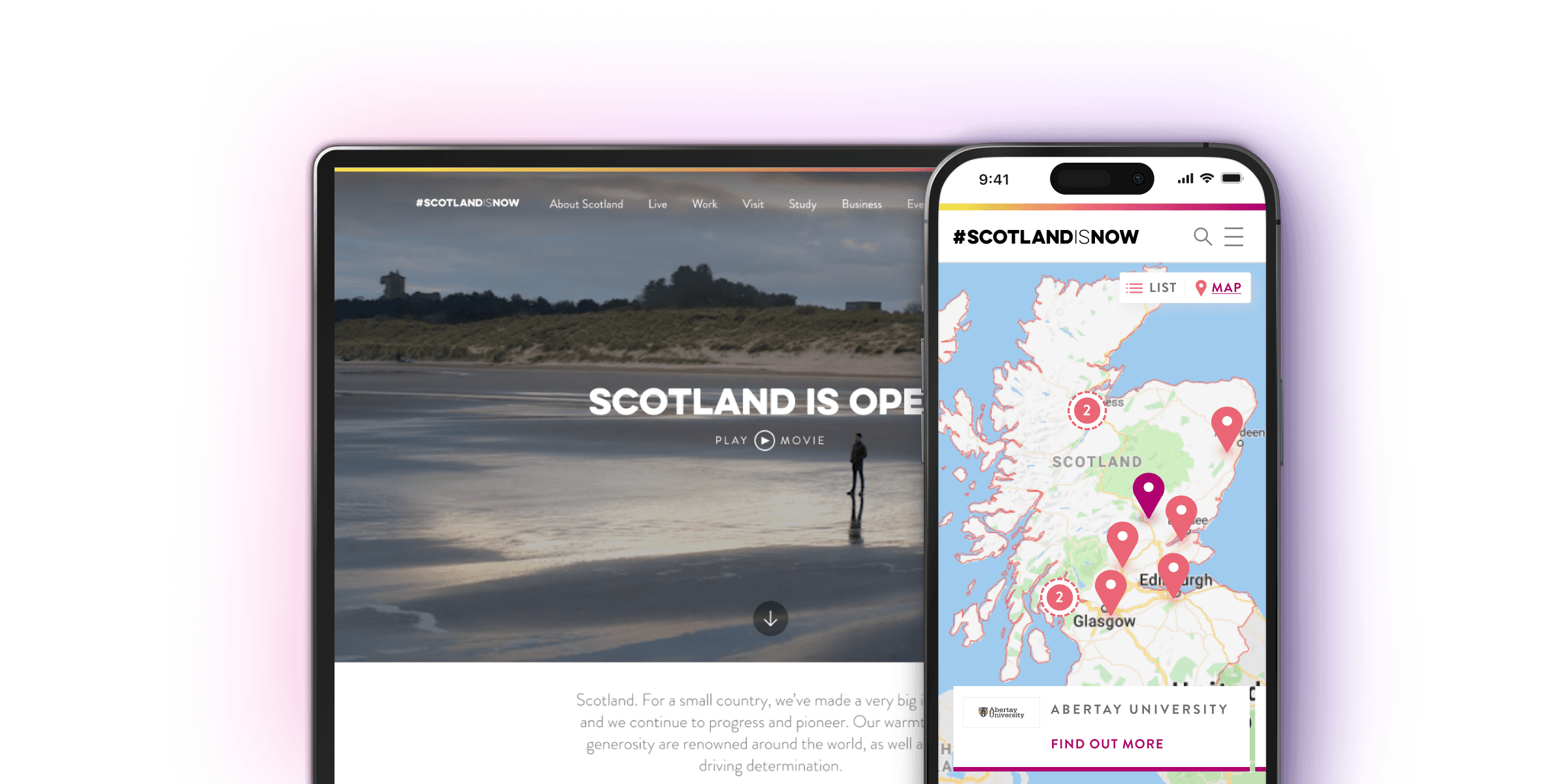
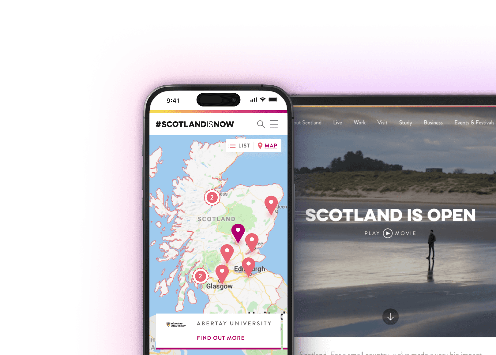
The separate studyinscotland.org site had been performing poorly and there was no longer enough funding to properly maintain it. Therefore the plan was to use scotland.org/study as the main hub for students interested in studying in Scotland.
The business section of the site hadn't performed as well as expected. We were tasked with carrying out some research to understand why.
The government had introduced a new Digital First Standard since the initial launch meaning the site had to be WCAG AA compliant and all work would be assessed to ensure best practice user-centred design principles were being followed.
Initial observational research
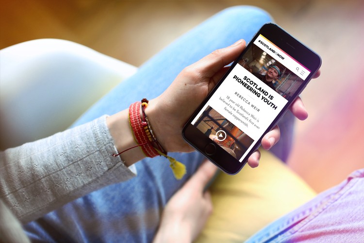
The scotland.org site is targeted at people looking to live, work, visit or study in Scotland from overseas. Although there had been lots of marketing and survey research carried out to establish the interests of target audiences, there had been very little usability research carried out on the site.
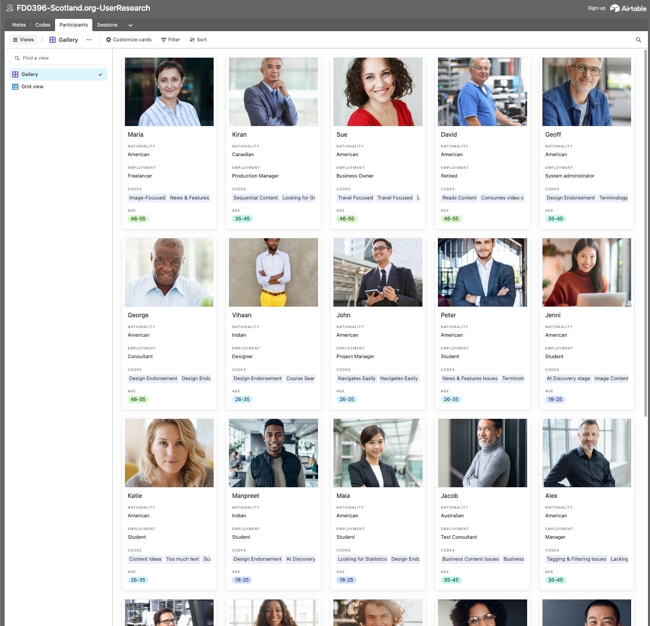
I wanted to understand the barriers students and business people might be having on the site. So I setup remote sessions with participants from America, Australia and India; three of the biggest target markets the team had identified.
Using a testing tool called Ping Pong, I was able to plan, recruit and screen sessions resulting in a set of insights to inform or ongoing work.
Clips from early user testing sessions with participants from America, Australia and India
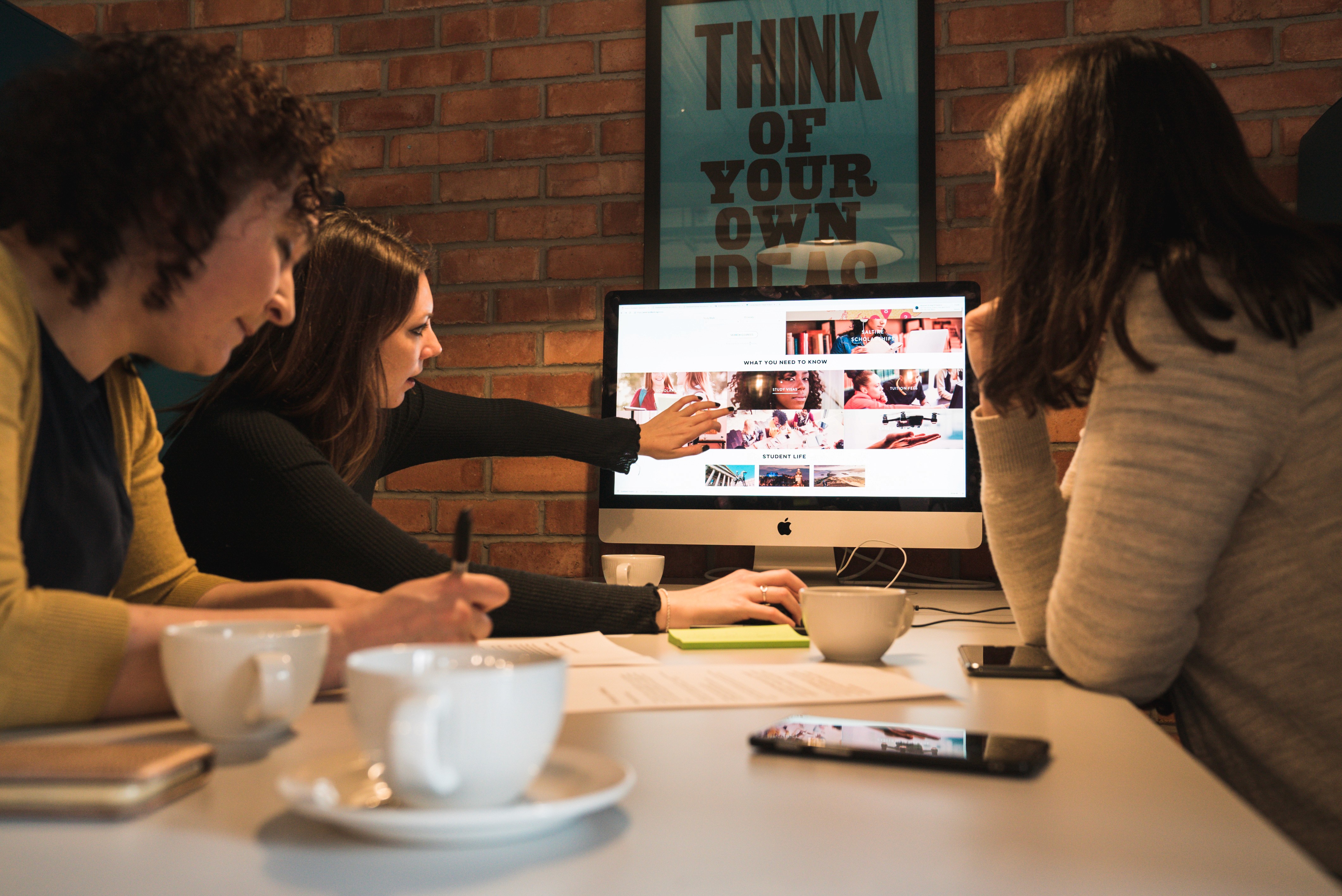
Building empathy for usability issues and getting buy-in from stakeholders
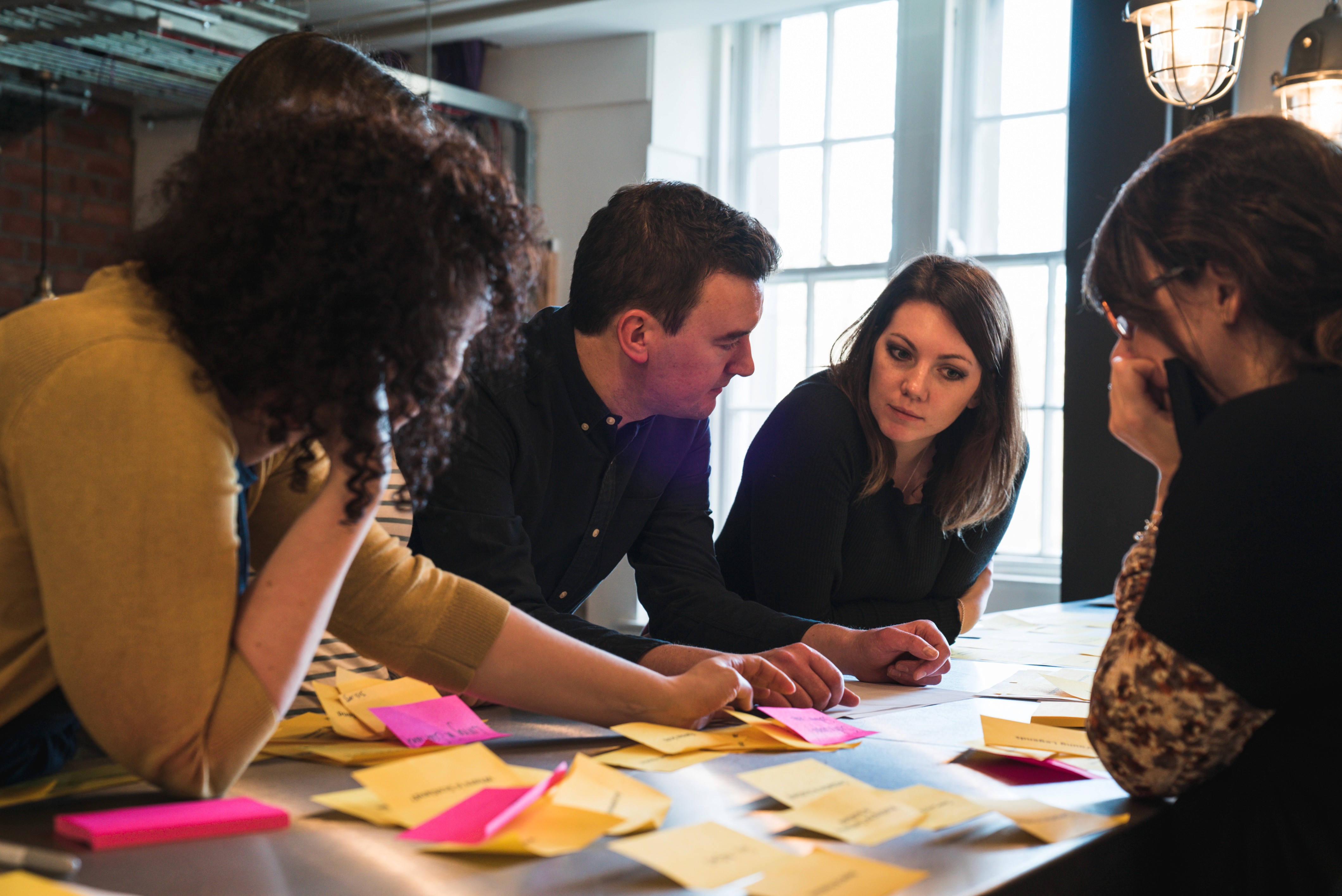
During testing, I had observed a number of biases and behaviours such as "menu-blindness" or the tendency to avoid using menus and looking for on-page links instead. Having spent a bit of time with the team, I could tell the best way to help them understand usability issues was to ask them to complete similar tasks from the perspective of the research participants. I planned a workshop and setup the same tasks, but made adjustments to the site like turning off the main menu.
A photo of the stakeholder team attempting to complete usability tasks on mobile
Understanding the information architecture
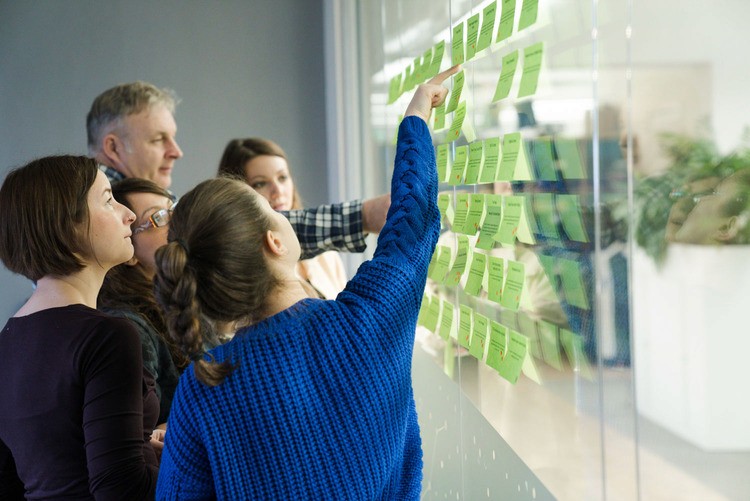
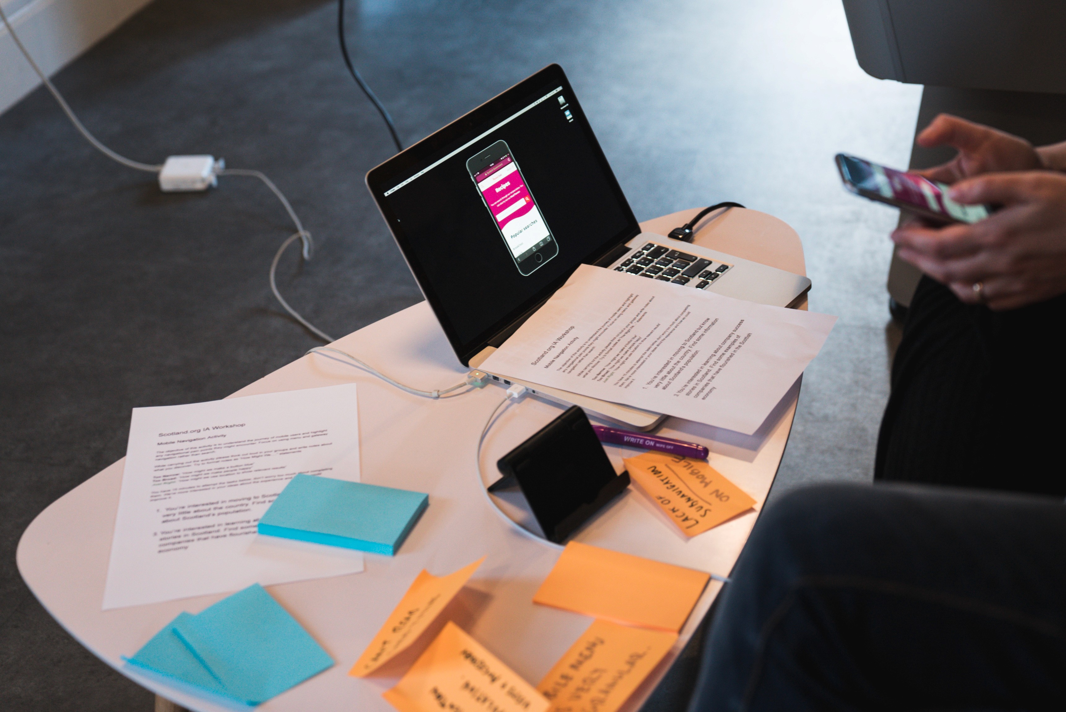
Migrating content from the Study In Scotland site meant understanding what to migrate and how the content should be structured in the expanded "Study" section. We conducted SEO and analytics analysis to understand where the highest value content lived on the current site and I set up some card-sorting activities with the team to help us organise content.
A card-sorting session with the team
Leaning on our design system
The design team had already created a well-organised set of components from the initial build of the site. So rather than starting from scratch, we decided to utilise the current system and make updates where we needed to. This allowed me to work directly with designers and developers to rapidly iterate the UI based on research insights.
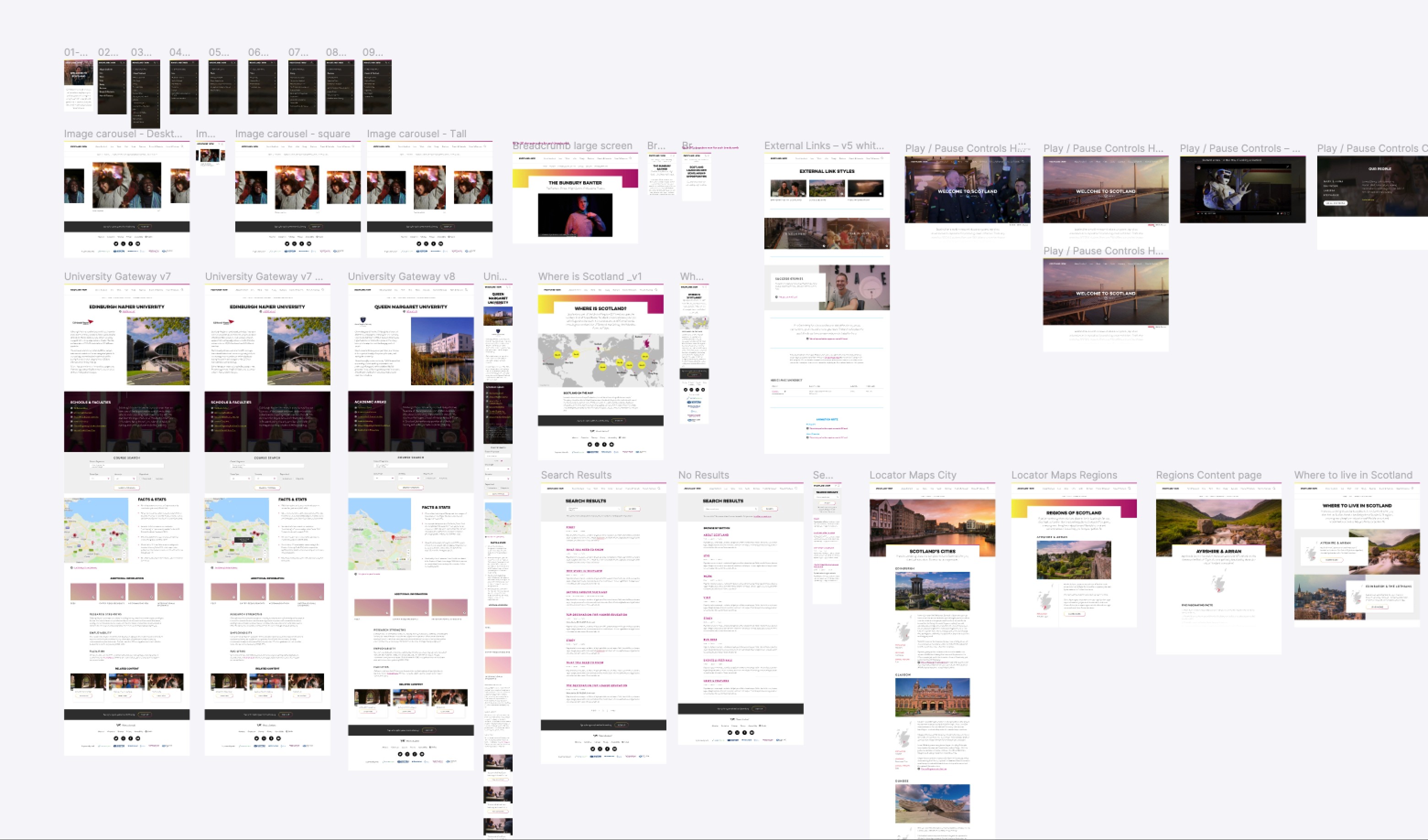
An example of component and template designs using our component library
Testing with disabled users
As part of the Digital First Assessment process, we needed to prove our site was accessible for everyone. Although we used automated testing throughout the project to ensure we were building and designing accessible components, automated testing only tends to highlight around 30% of the barriers disabled users face.
We decided to run a research study with users who had a broad range of disabilities to learn more about the types of barriers they would face when using the site.
I planned and facilitated all of the testing sessions. This involved travelling to participants' homes around Scotland and recording the barriers I observed. The videos I captured were played back to the team and hugely influenced how we approached the next phase of design updates.
Clips from accessibility testing session I ran during the project
Outcomes and tradeoffs
When we launched the updates in 2019, it was one of the first Scottish Government sites to pass a Digital First Assessment. As a team, we learnt a huge amount about designing creative digital content in an accessible way while achieving all of the commercial objectives we set out at the start of the project.
I was lucky enough to work with an amazing team of designers, developers and account managers on this project. Without such a talented group these outcomes wouldn't have been achieved.
Team